Cyberdrome
Development Details
Engine: Unreal Engine 4 (Version 4.19.2)
Genre: Arcade Arena Combat
Platform: PC, Steam
Development Time: 7 months (May - December 2018)
Team Size: 16 developers
Gallery
Pillars
Sword as Primary Means of Interaction
Aggressive, Fast Paced Action
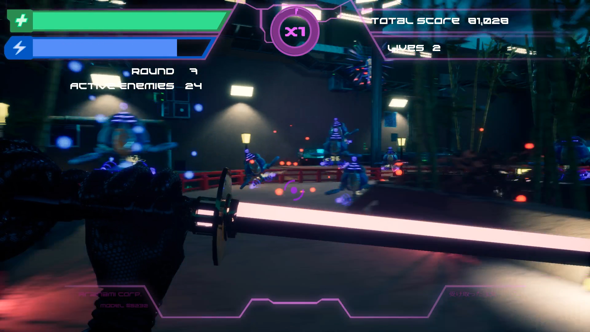
Traditional Japanese aesthetic + Cyberpunk
Synopsis
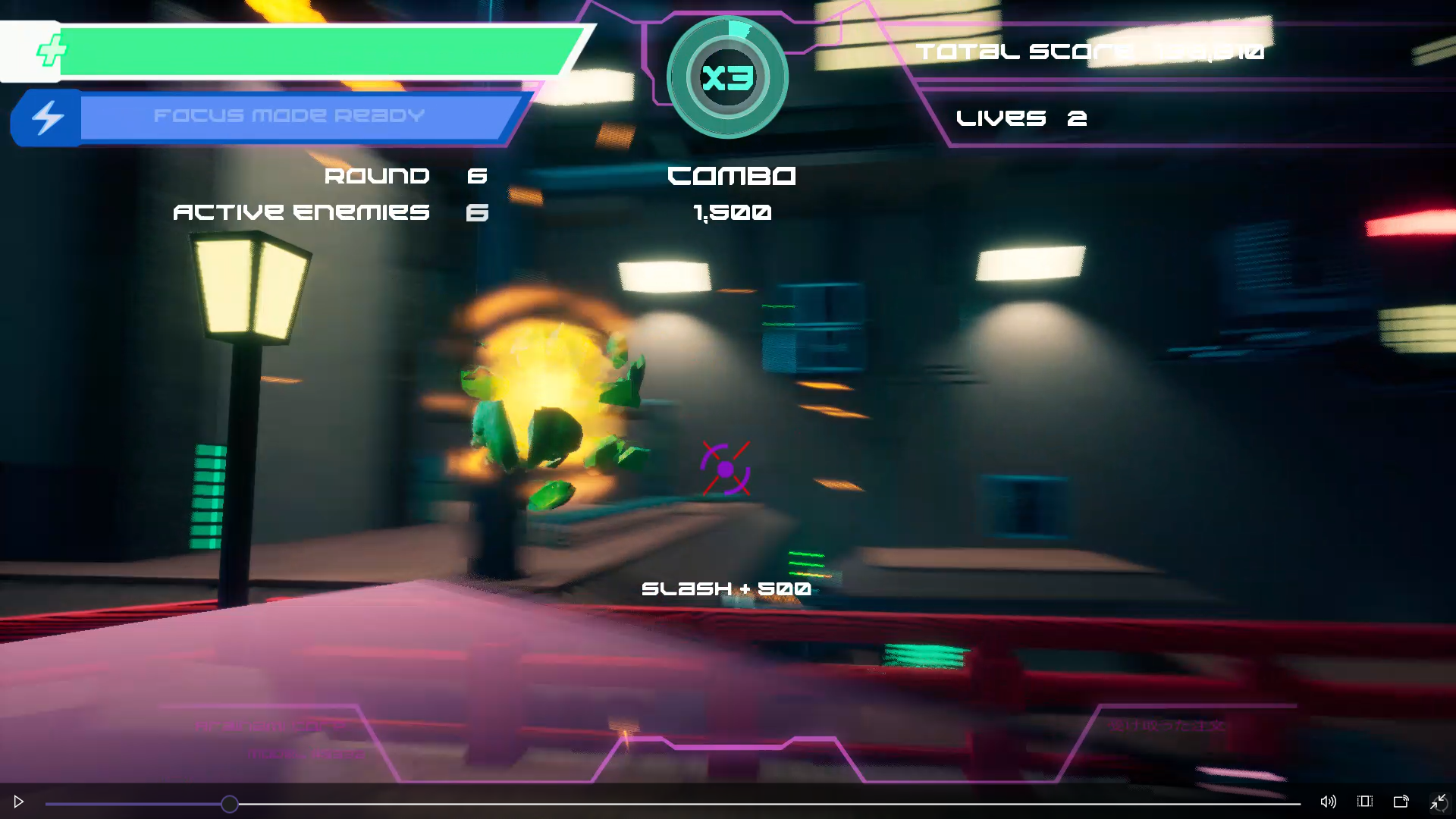
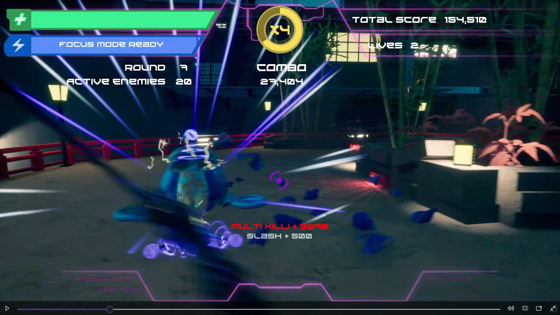
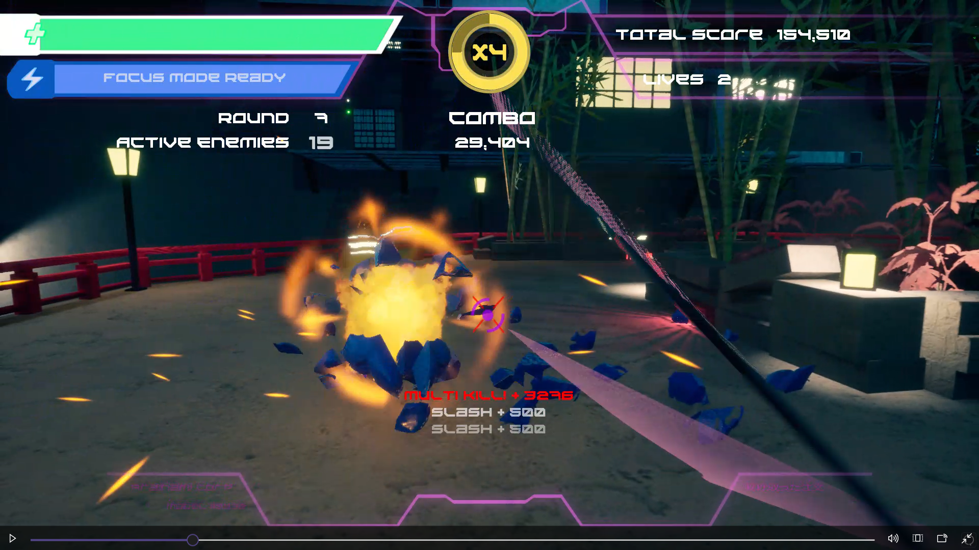
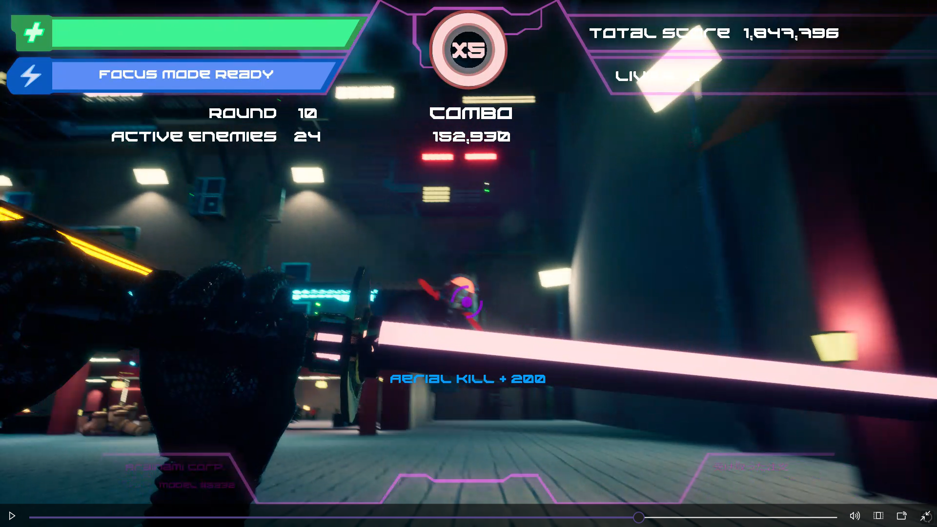
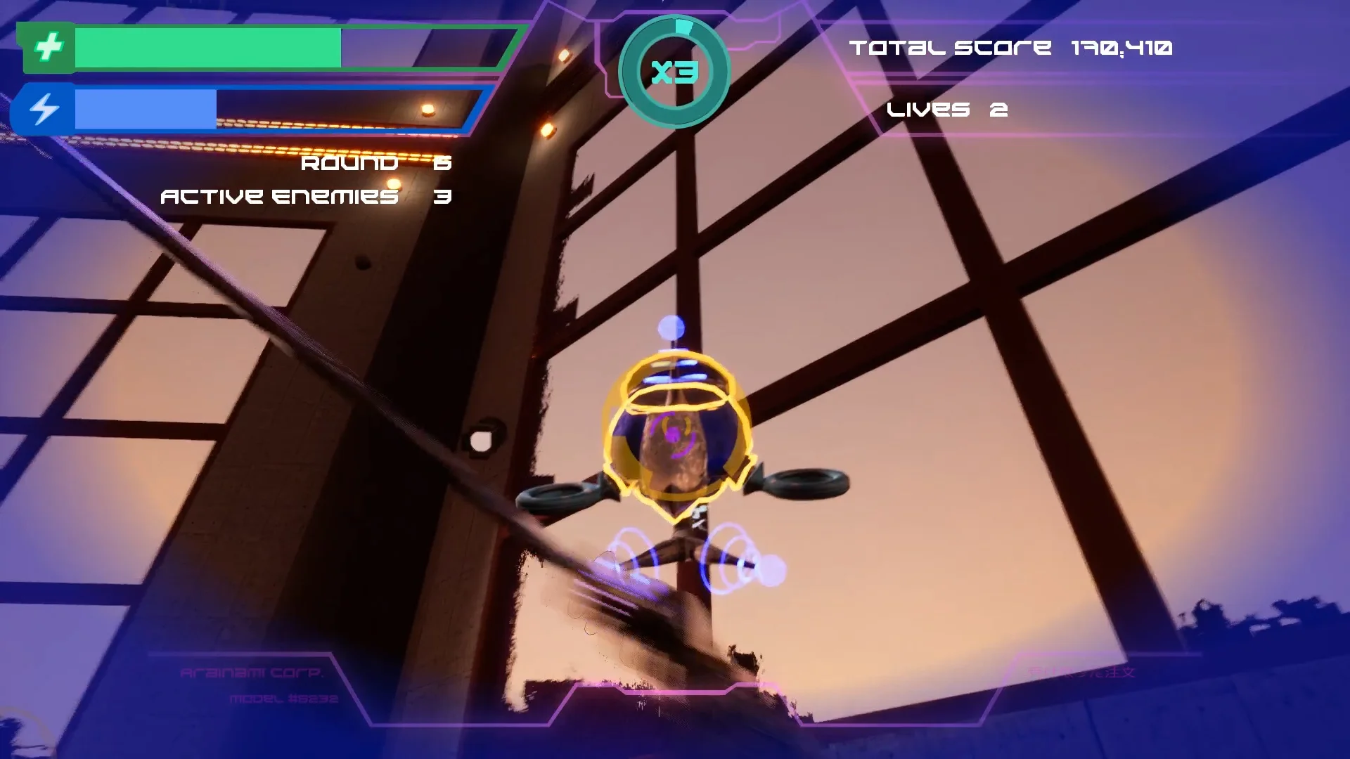
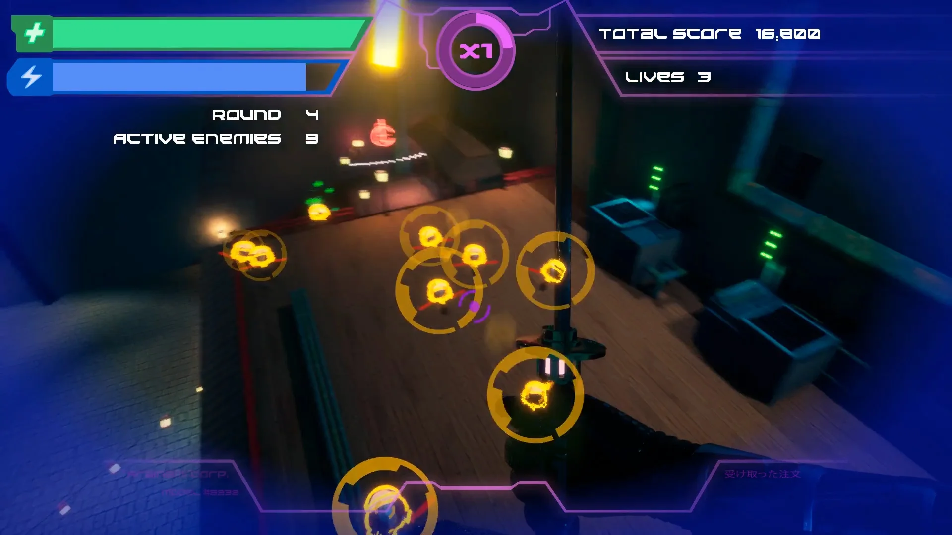
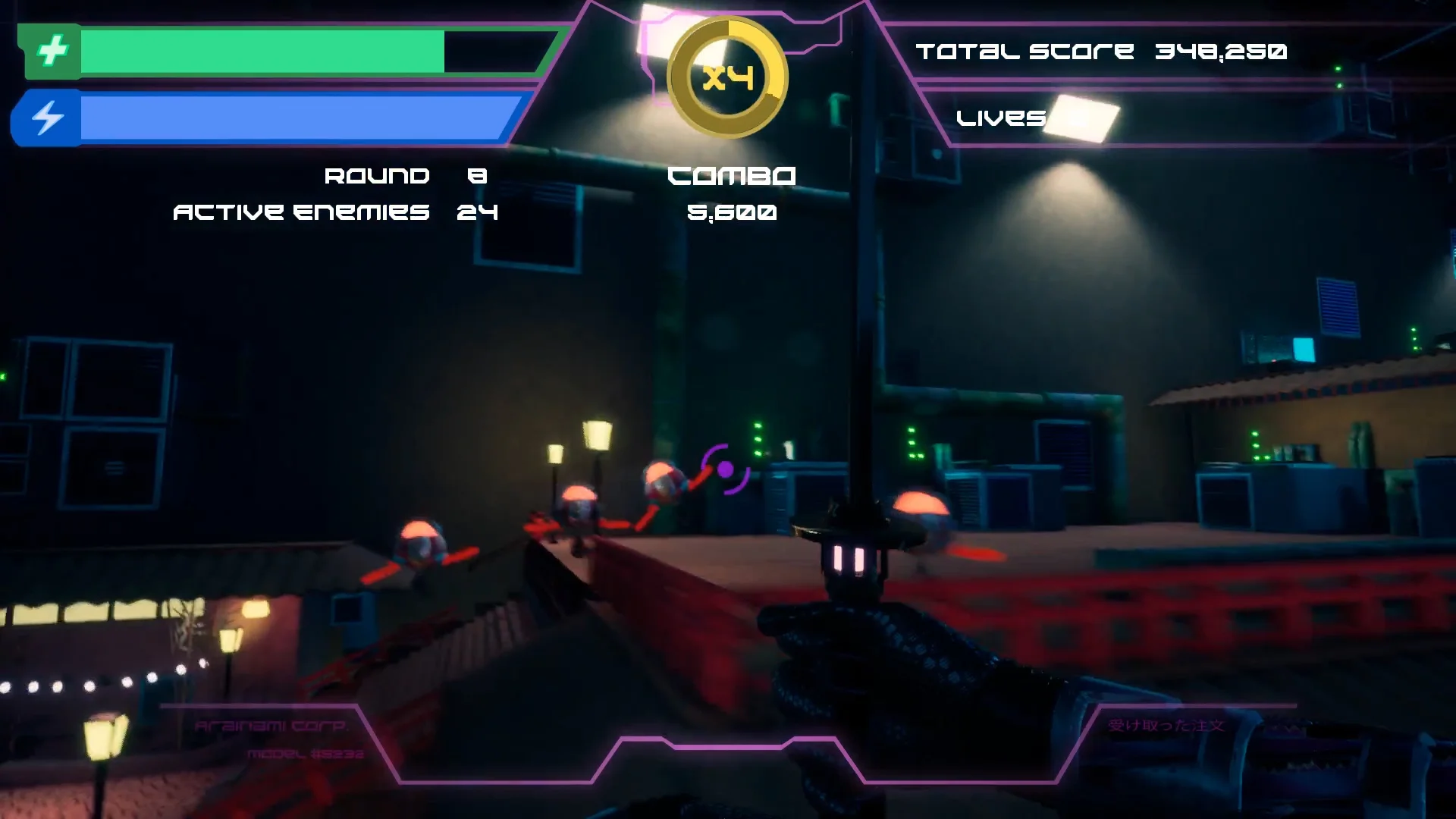
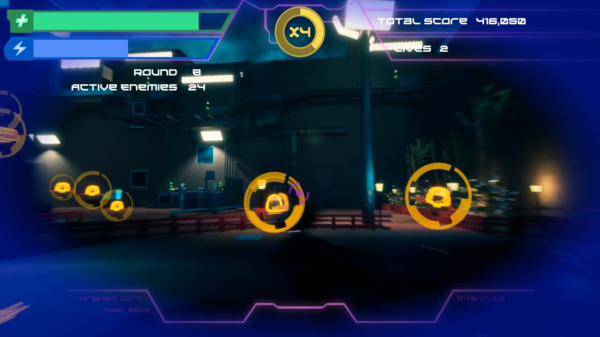
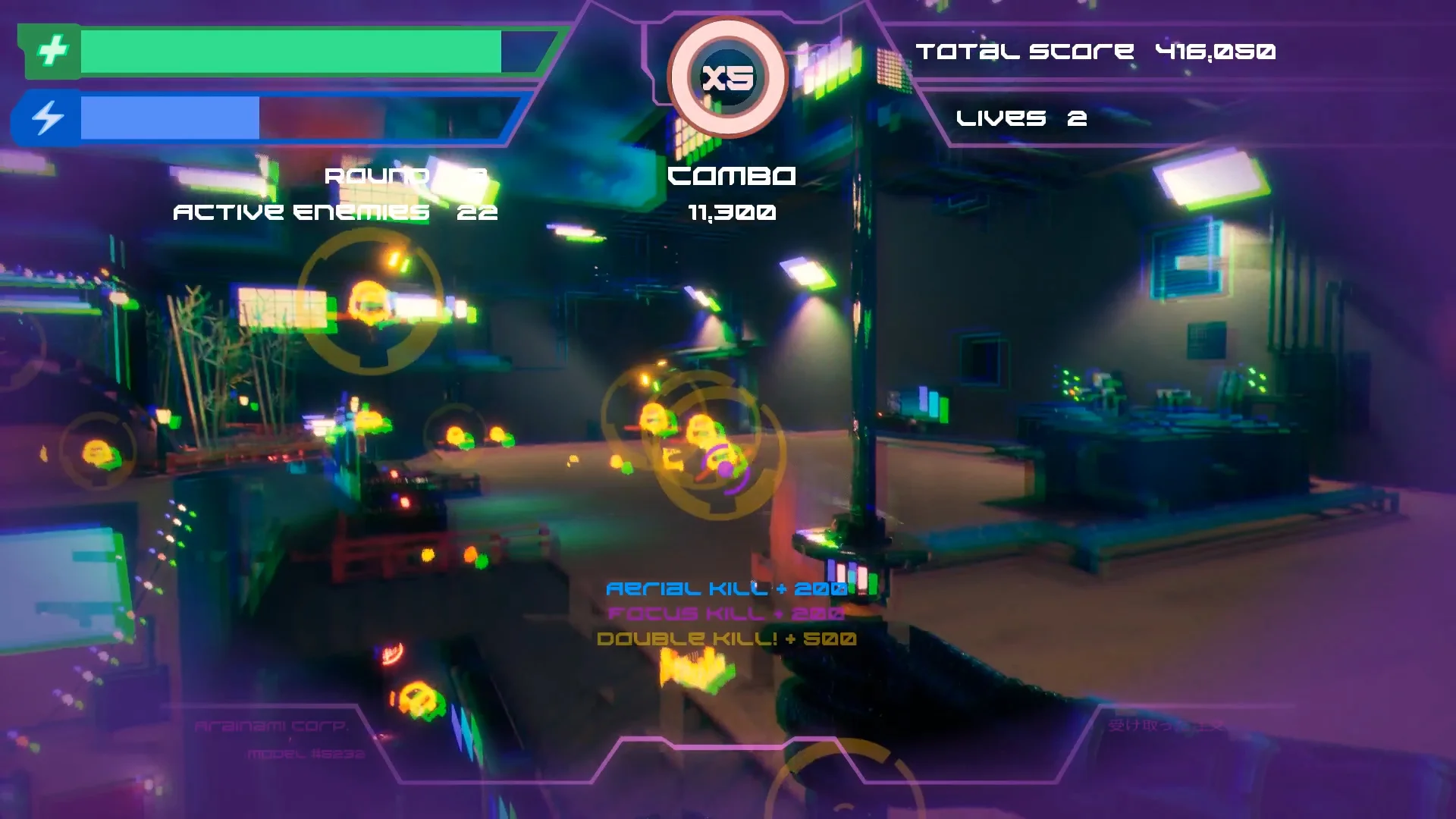
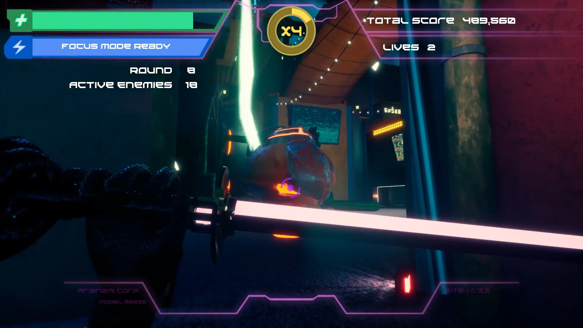
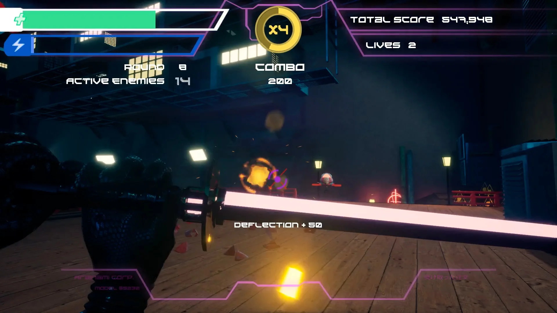
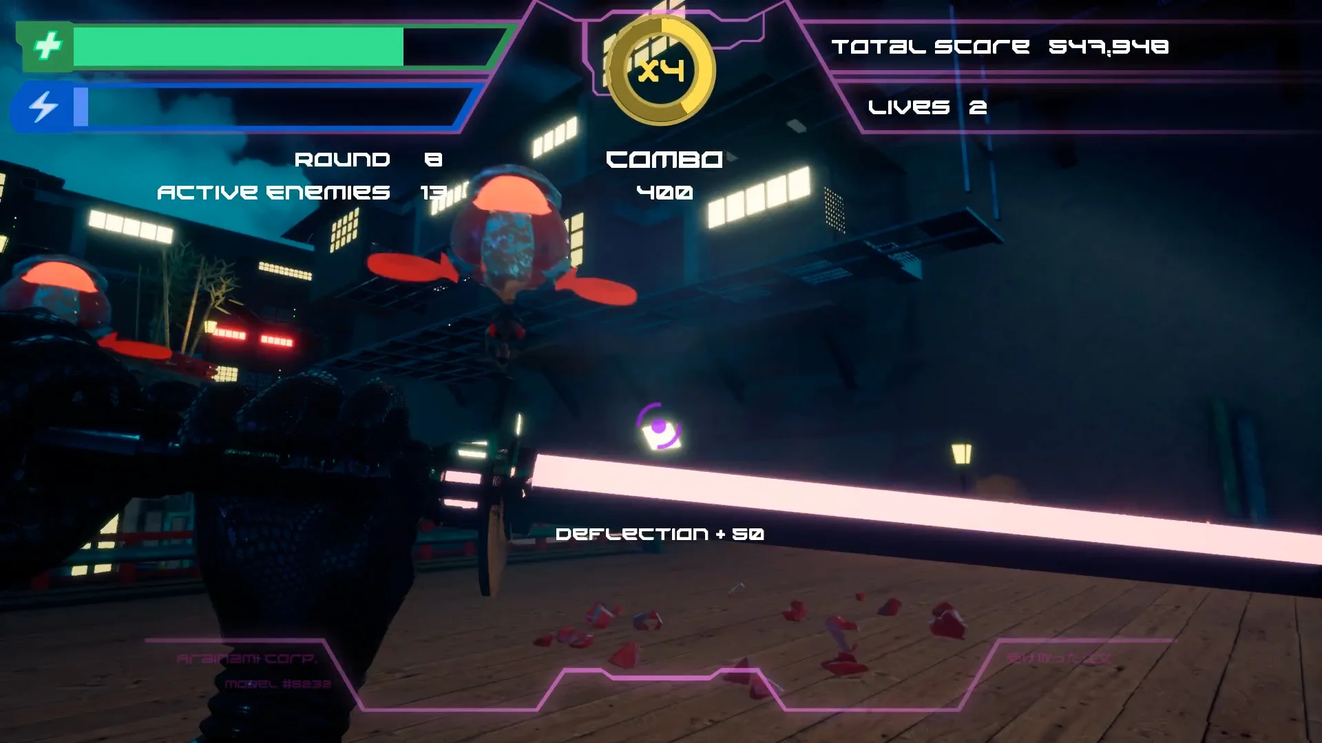
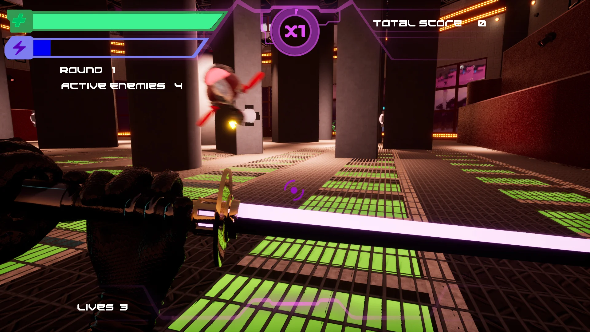
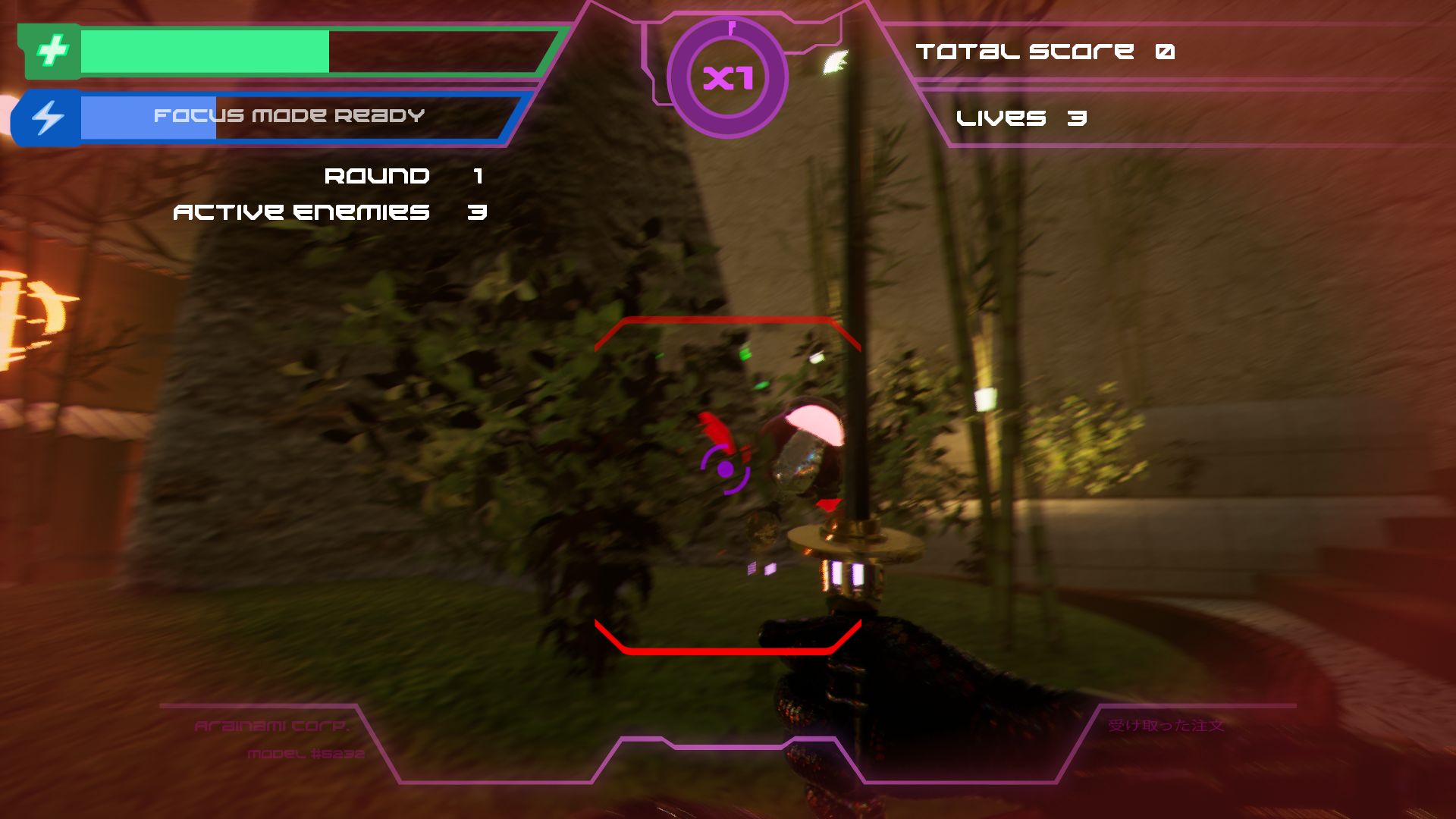
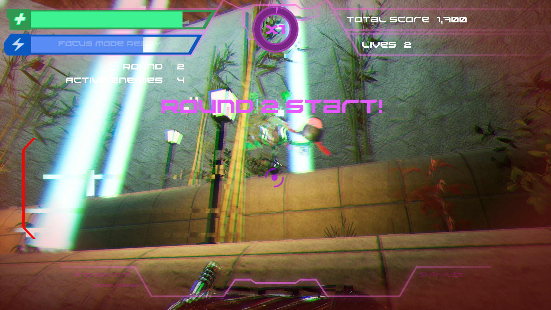
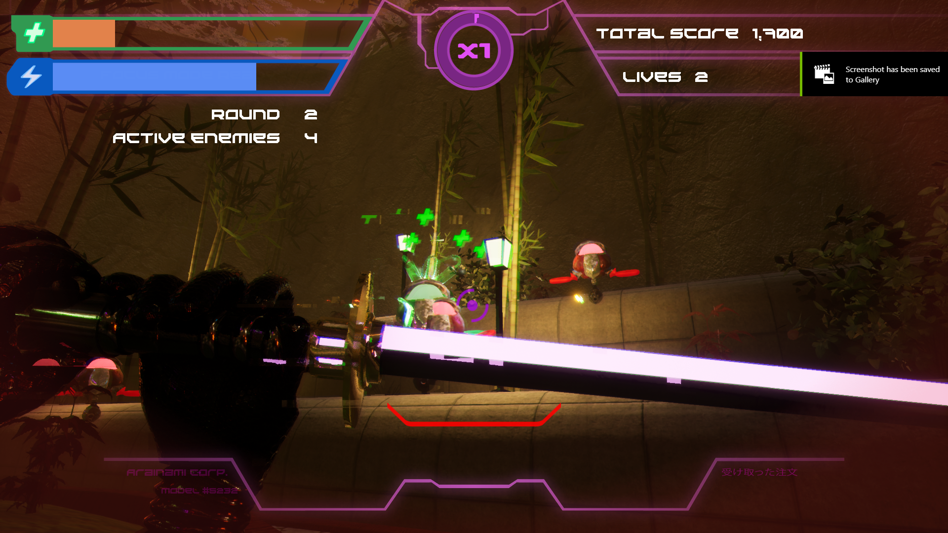
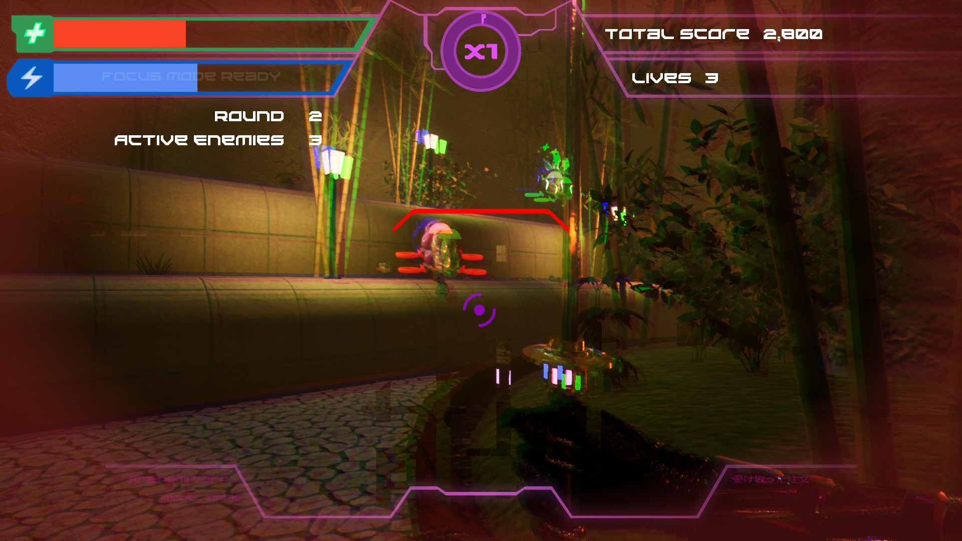
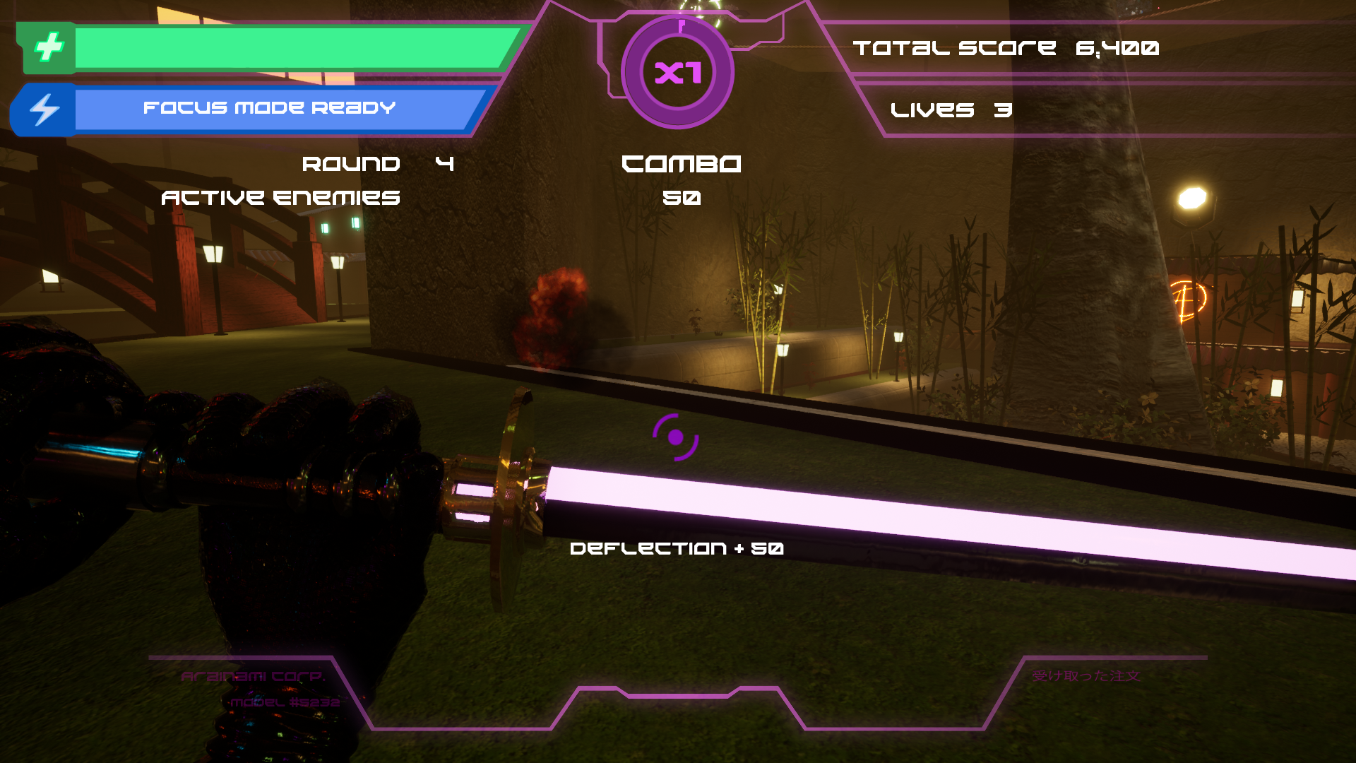
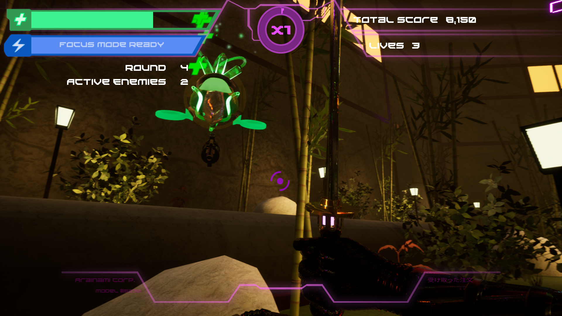
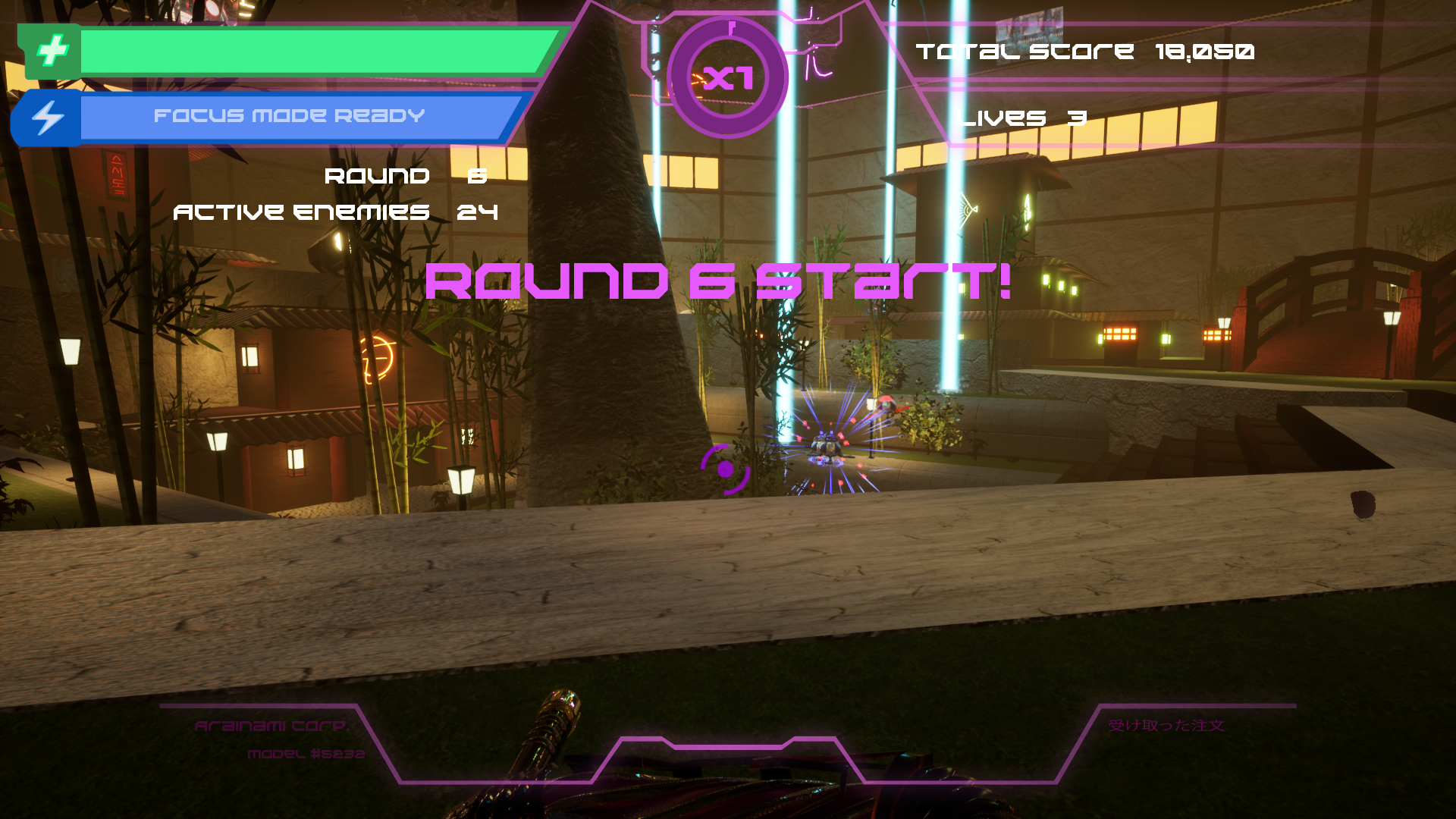
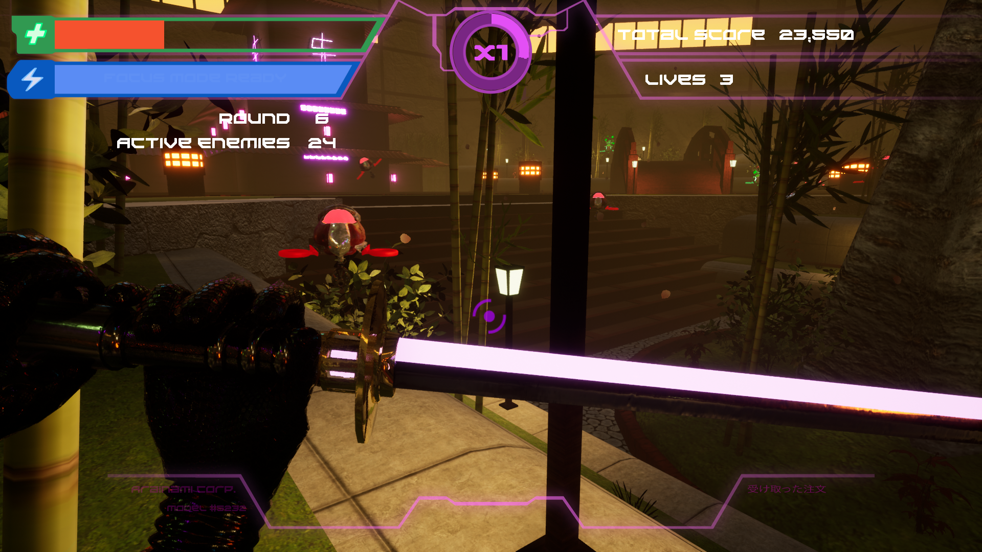
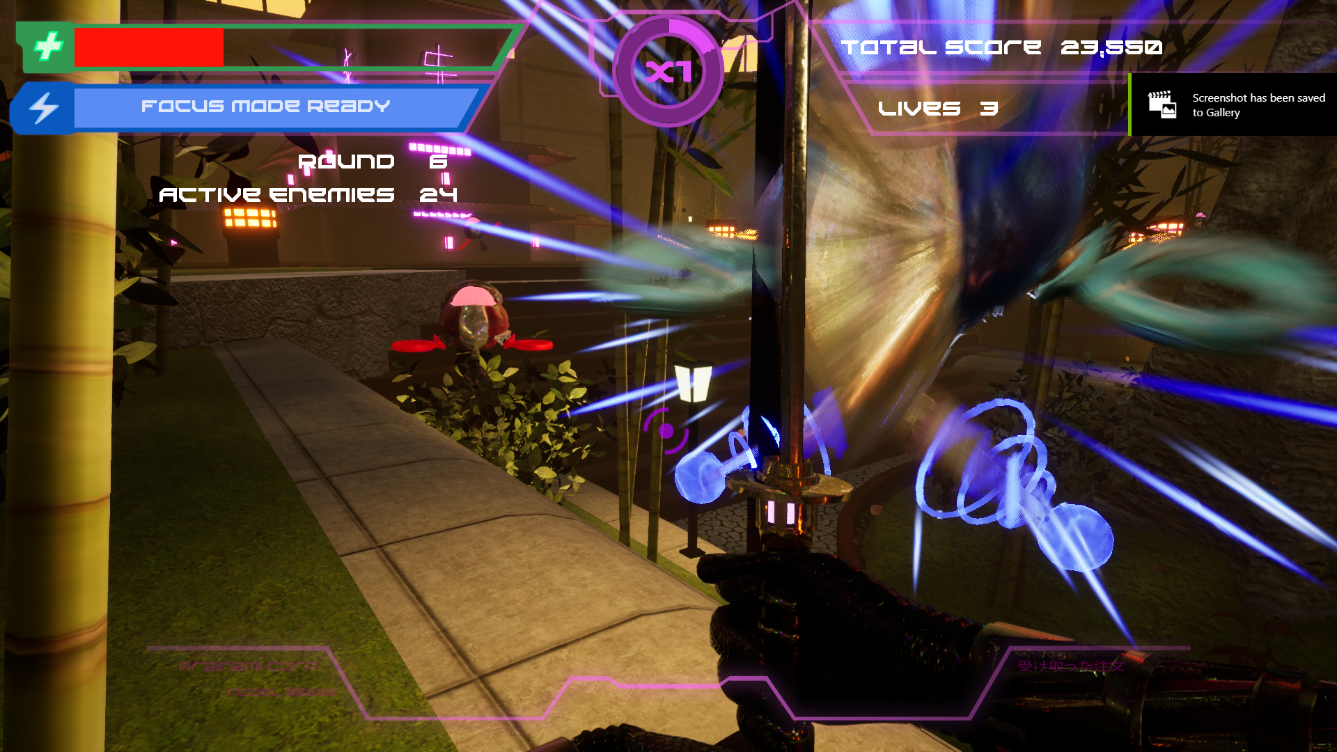
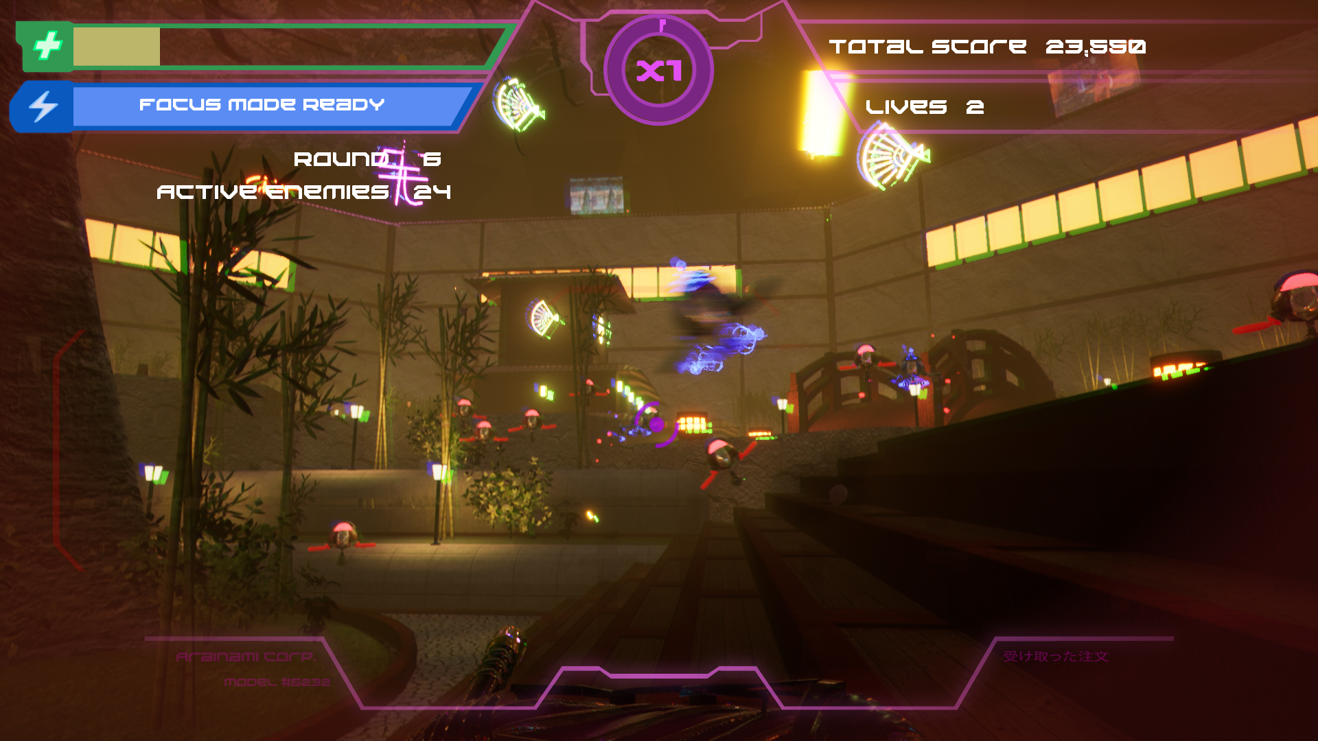
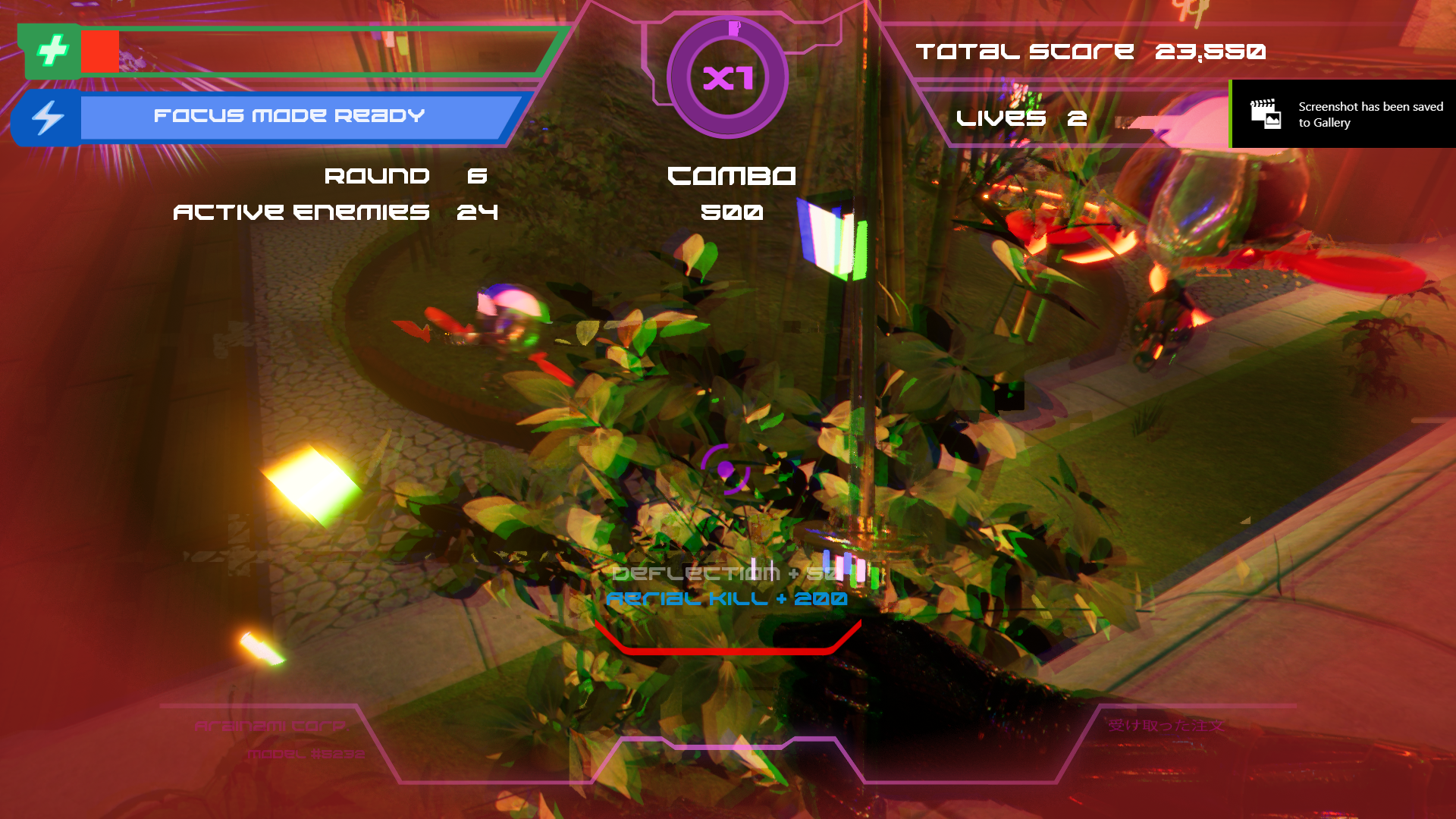
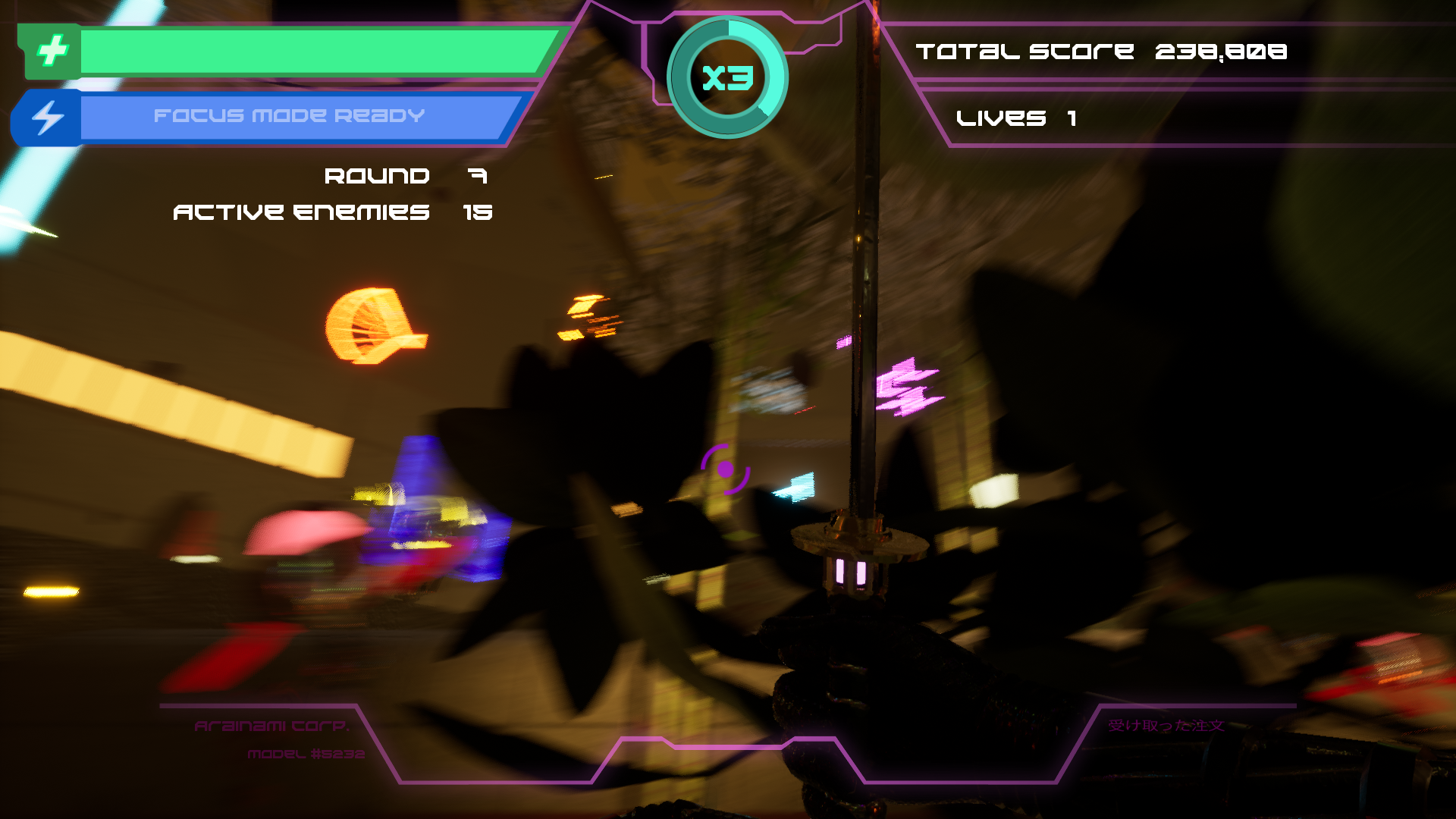
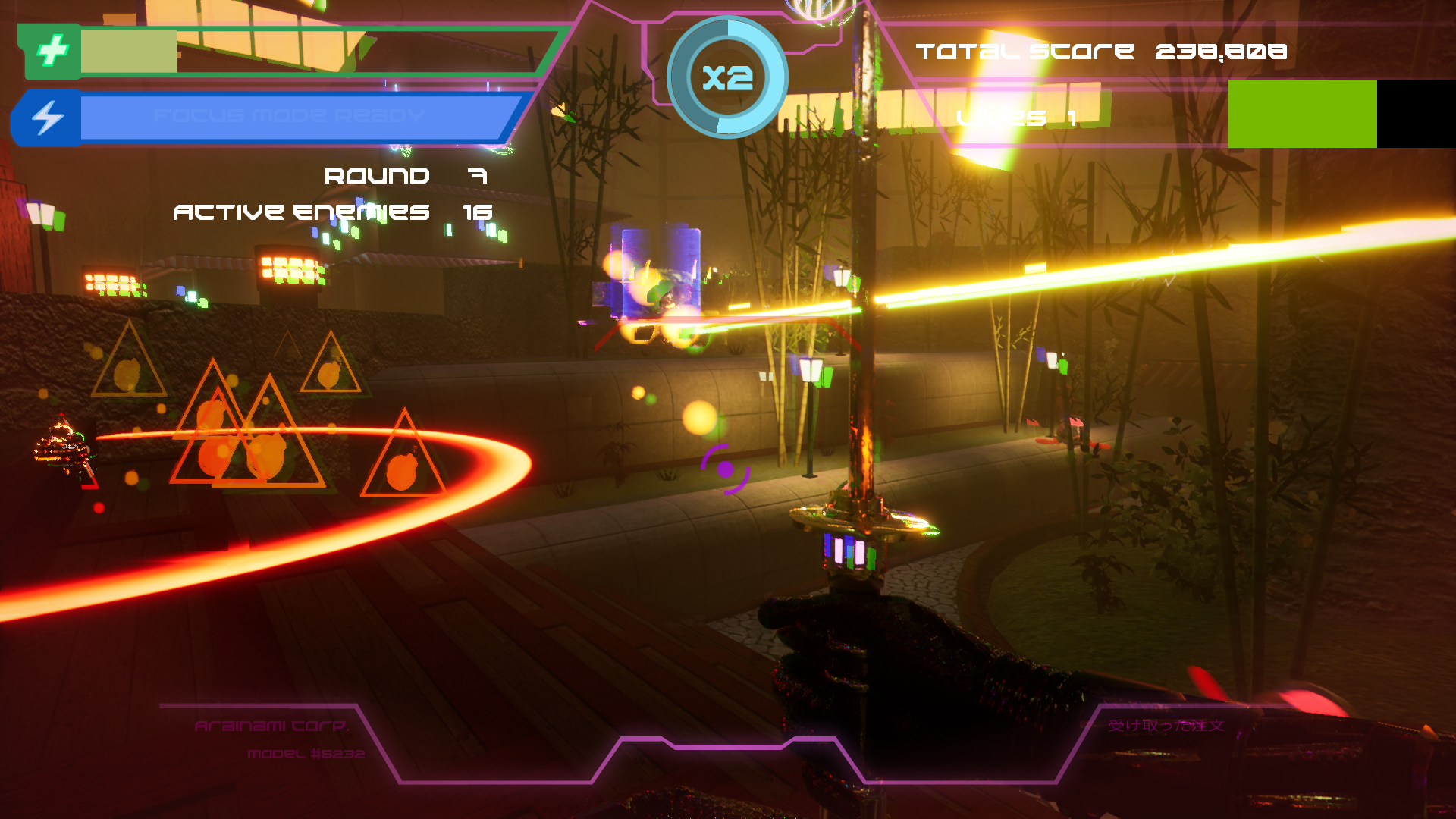
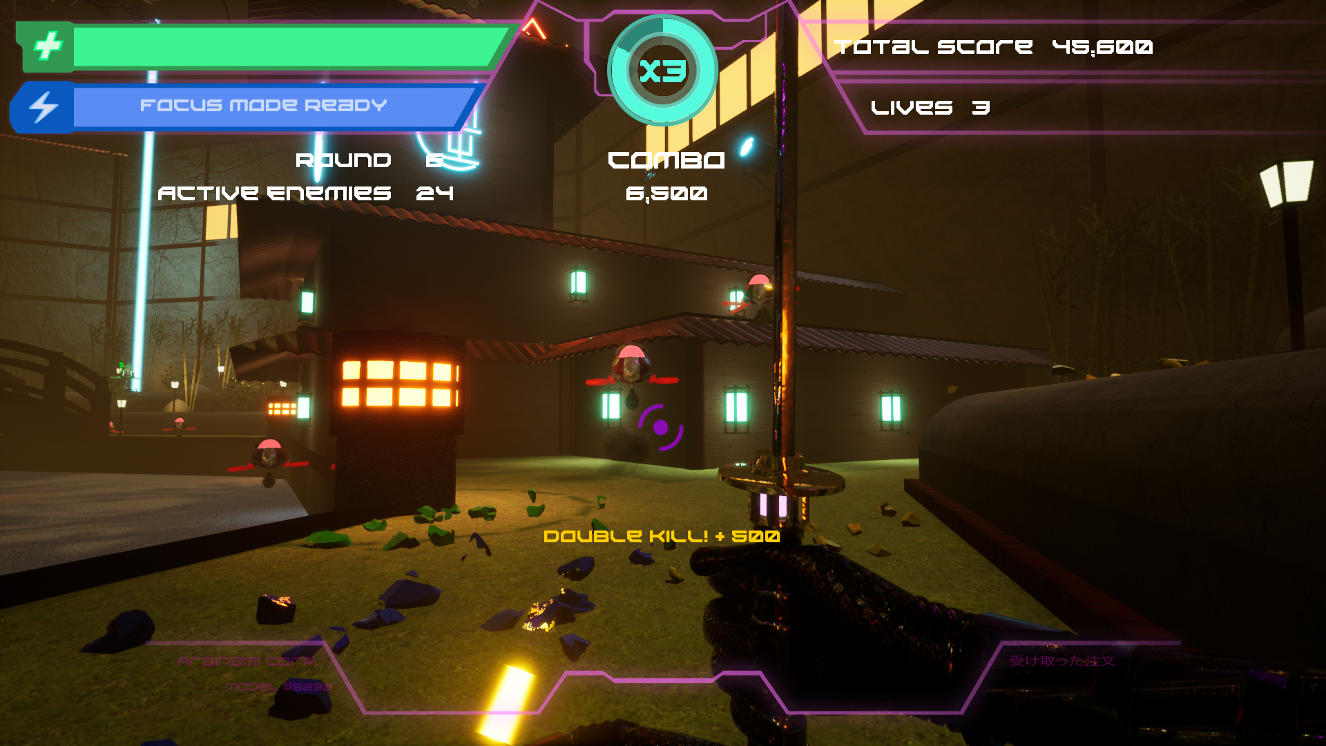
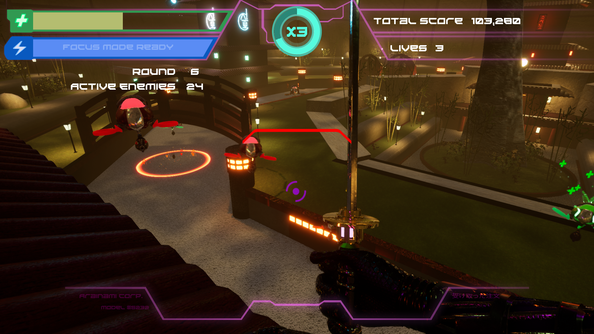
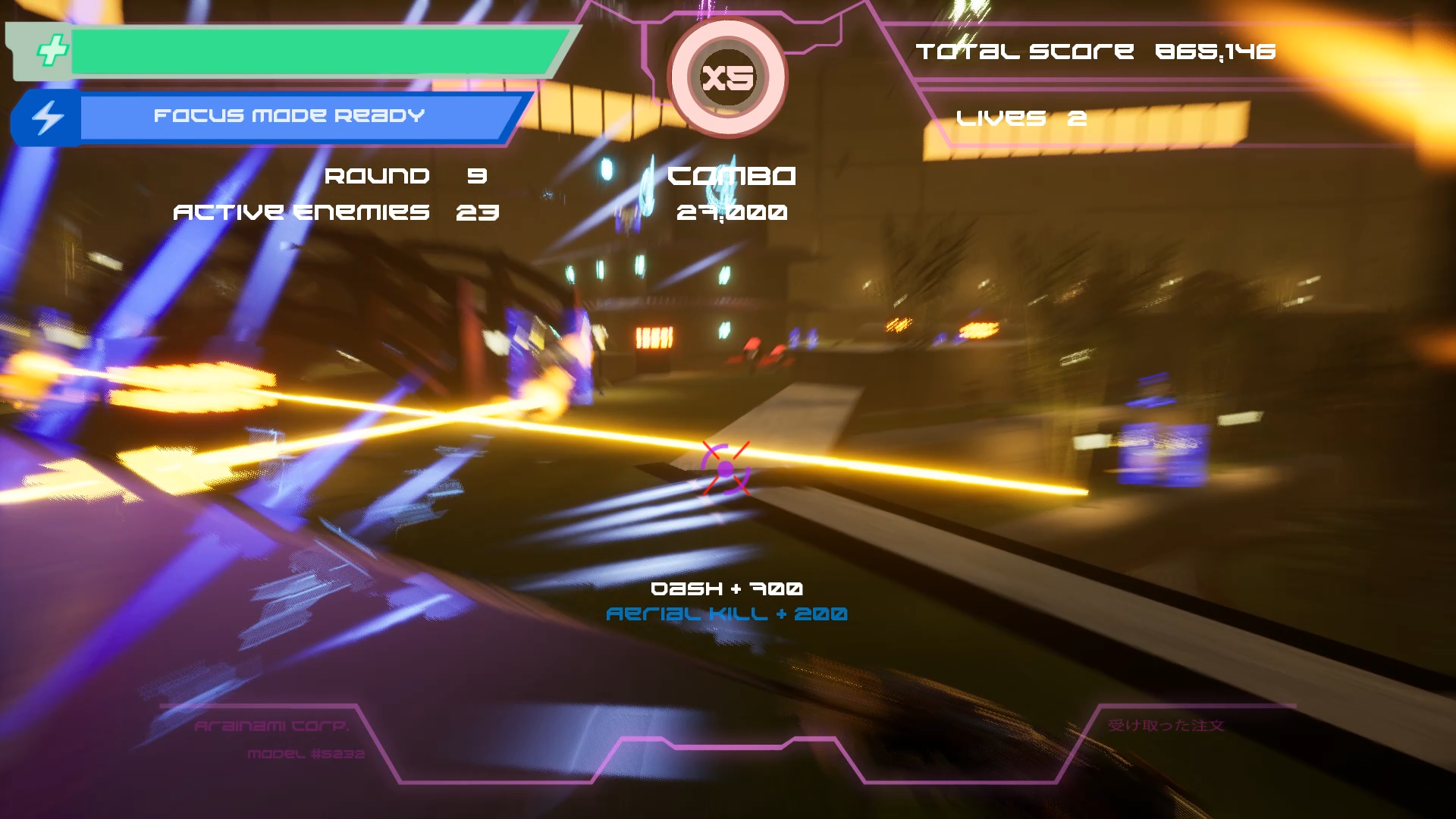
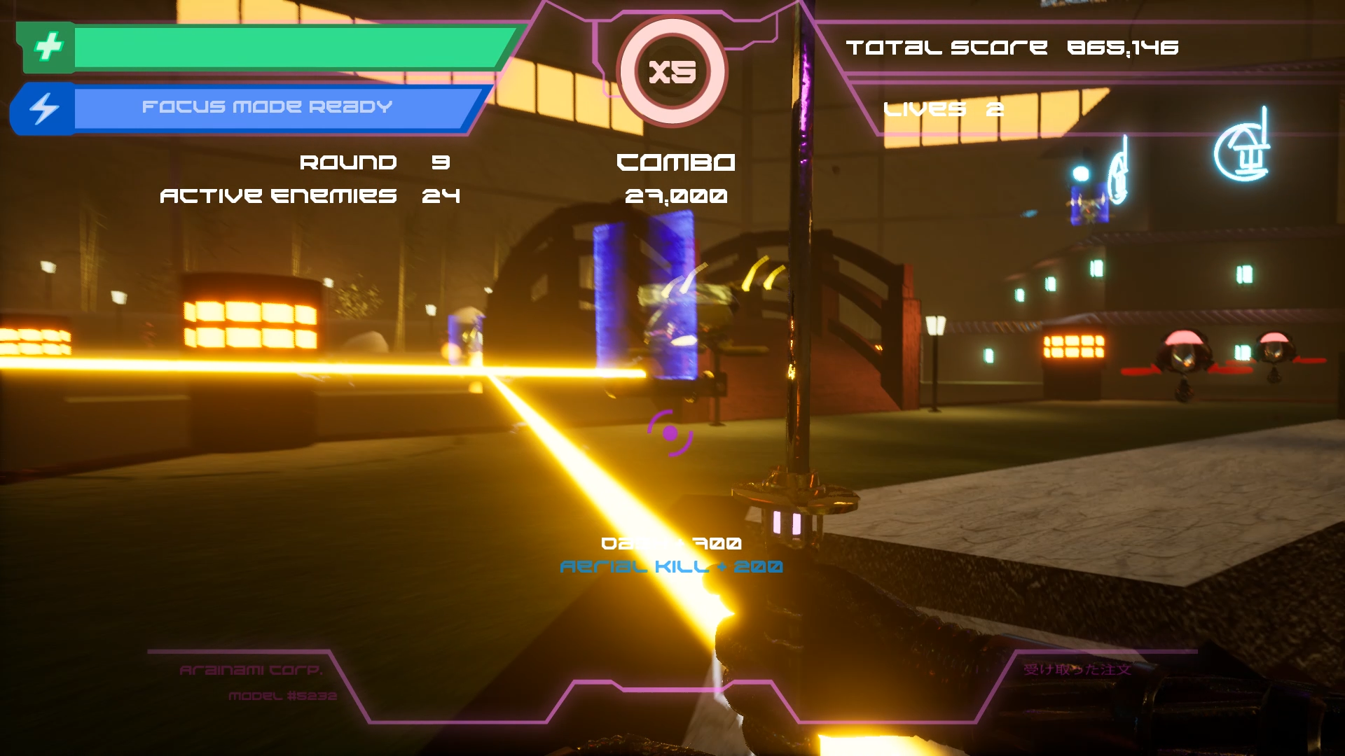
Cyberdrome is a fast paced, first person cyberpunk action game in which you use a high-tech sword and enhanced movement abilities to traverse dangerous environments and kill robots before they kill you. Rather than using guns, the player is only equipped with a sword that can be used to cut enemies in two as well as deflect enemy projectiles back at them. To make up for the lack of ranged attacks, our player has a variety of movement skills such as a forward dash, double jump and a focus mode that slows down time and adds aim assist to deflections.
My Role
Lead Level Designer
As our lead level designer, I had my hands in engine significantly less than my designers and mostly handled personnel matters. Early on within the project, I concerned myself more with getting to know each designer on my team better and establish responsibilities within the team that lined up with the strengths of my teammates (our ARCI chart) as well as setting up our pipelines. Once those were established and proven out, I worked with both my team and our Game Designer (GD) in order figure out what exactly a level for our game would have to look like. This turned out to be tricky, as conflicts between teammates and the ever-evolving situation with our stakeholders meant that we had to pivot pretty heavily around our vertical slice milestone to a different game style.
Once we settled into the groove of development and most of the management tasks moved into our list of completed tasks, I switched over to the role of supporting my designers in whatever way I could. Early on, this frequently meant figuring out why certain tools like Swarm weren’t working or being the one to follow up on the progress of art assets or code that my designers requested while later stages of the project had me following up on bugs in our bug list while my designers worked on fixing those bugs. When I did get to work in engine, it was more along the lines of setting up a tool that would help my designers accomplish their goals in their levels, such as an actor to load into any level desired or the invisible ramps used by our enemies to traverse between different elevations.
Our Levels
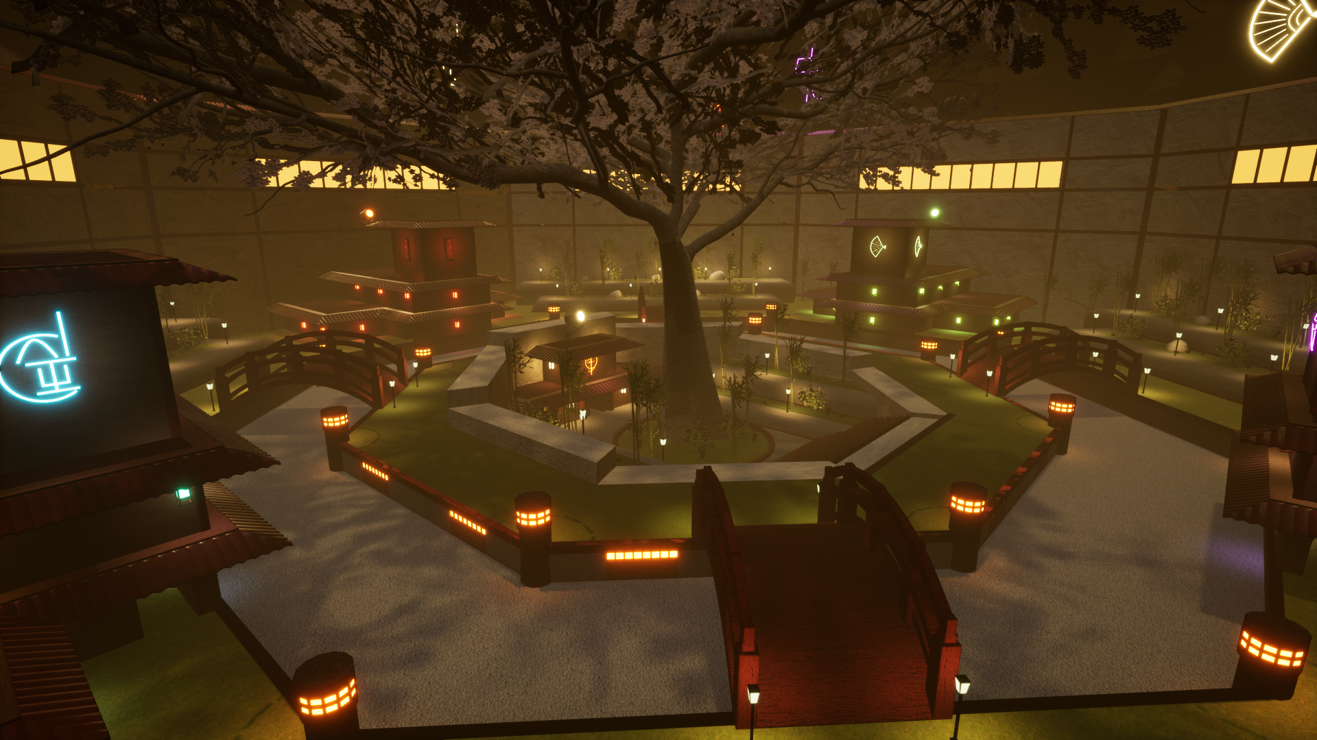
Zen
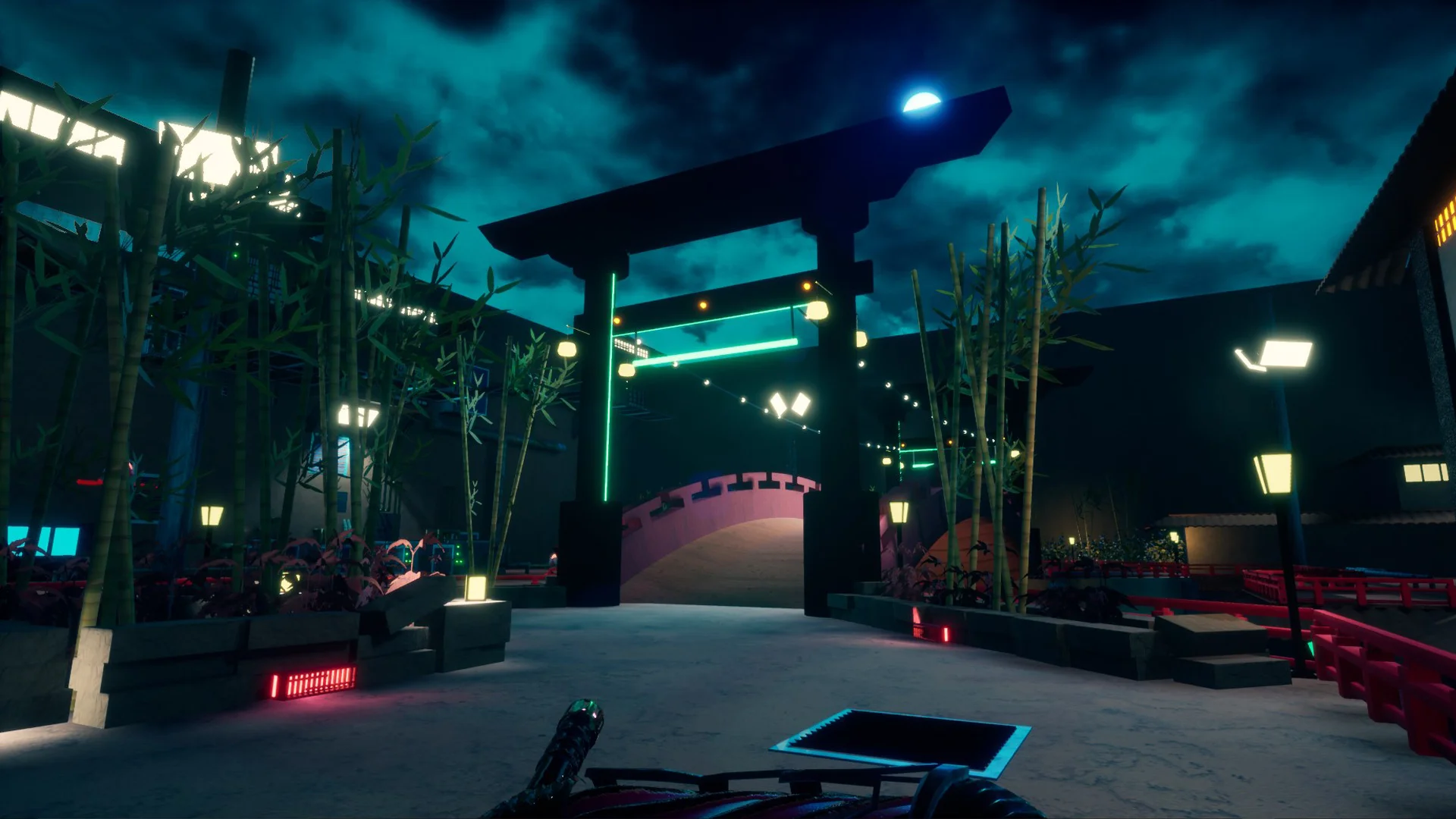
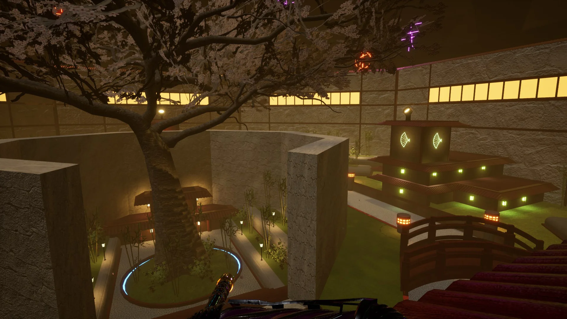
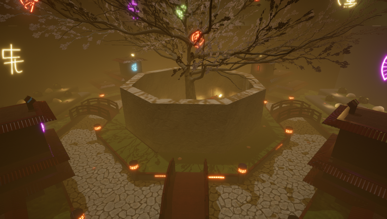
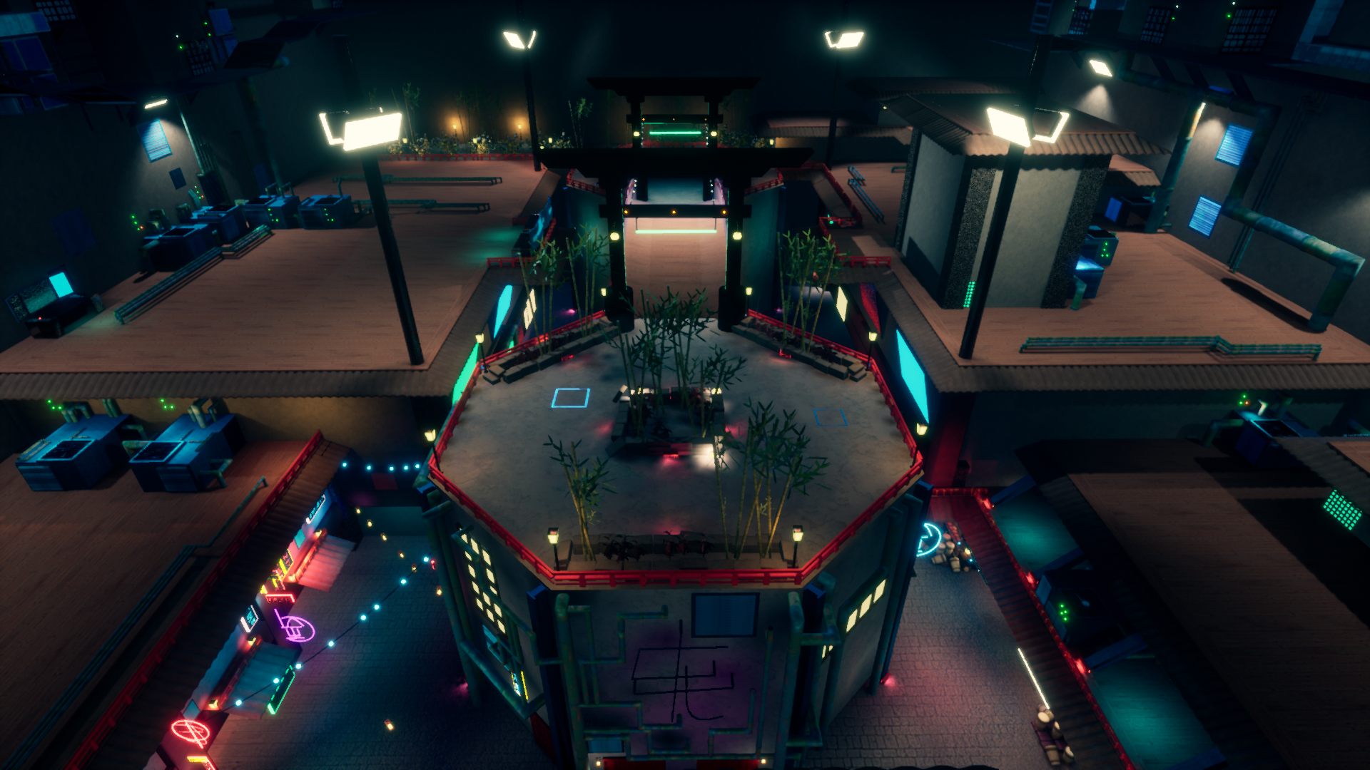
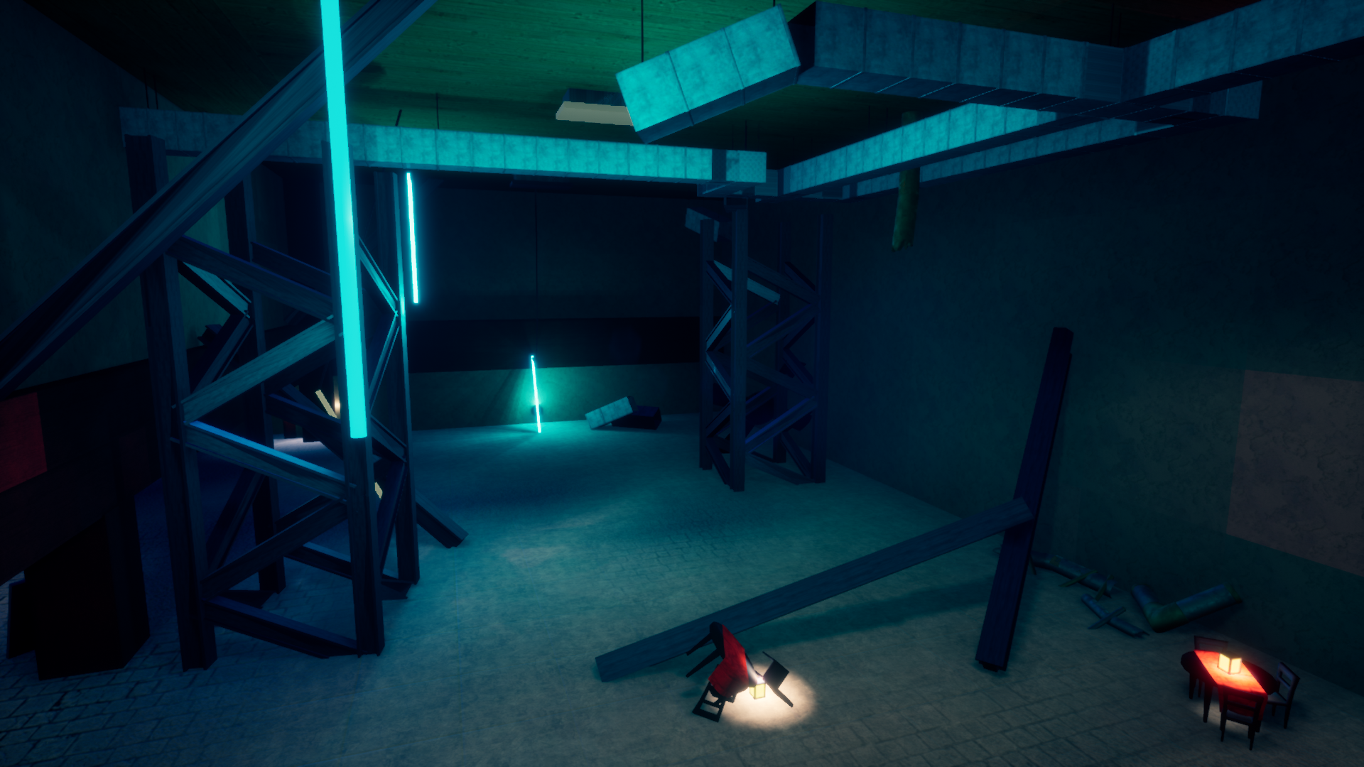
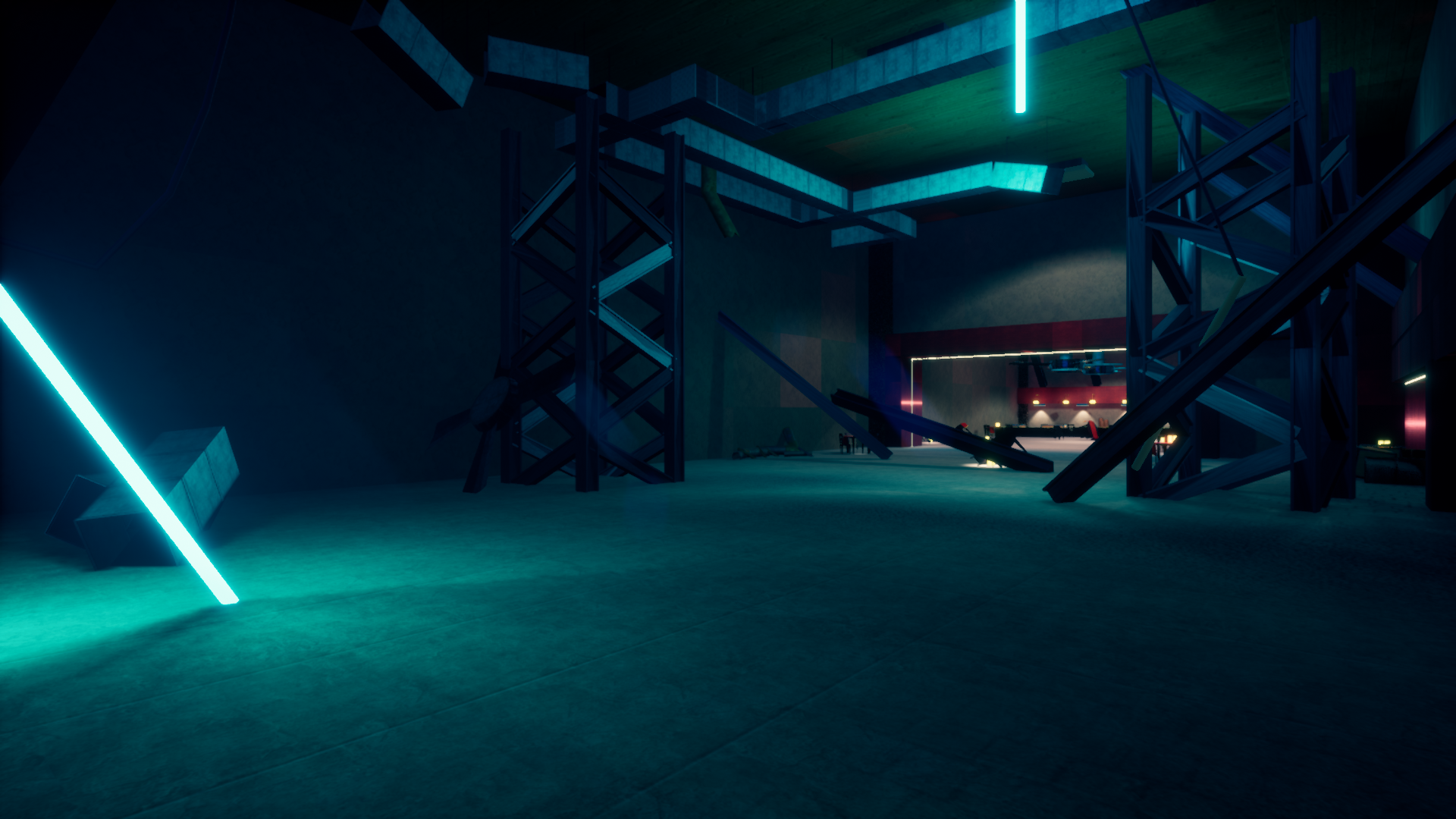
This level was primarily designed and worked on by Parker Johnstone. The central idea behind the level Zen was the idea of expanding playspaces. As you play the level, you start off in a smaller, more claustrophobic space. After clearing out two rounds of enemies, a wall drops down, exposing you easily to the rest of the level. After a middle round, the rest of the walls surrounding the starting area drop down, opening up the flow for the rest of the level. This level is intended to be the first to be played (it’s even the first level in the queue when you hit the “play” button), so we tried to gradually increase the challenge presented with each round while still keeping the overall challenge low.
The initial concept for this level (called Tumblr in its original pitch) involved three islands for gameplay. Each island was to be pretty small at first, but each round would expand the island being focused on and rounds four and eight were going to raise a bridge to the next level. While that’s what was pitched, that scared the programmers on our team. They pushed for us to make static levels that just had players being encouraged to move to different parts of the level by enemy spawns and trickery from the nav mesh. I ended up negotiating with the lead programmer and our programmer to get the compromise that the level turned into.
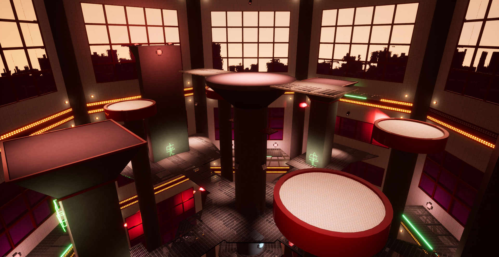
Dumpling Street
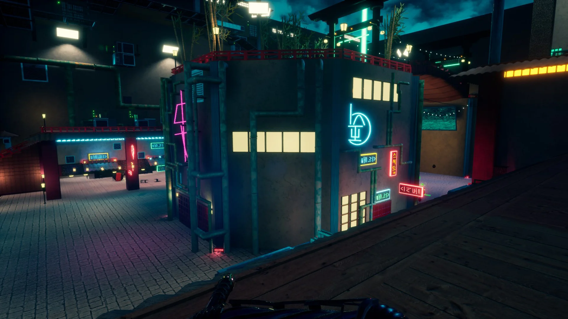
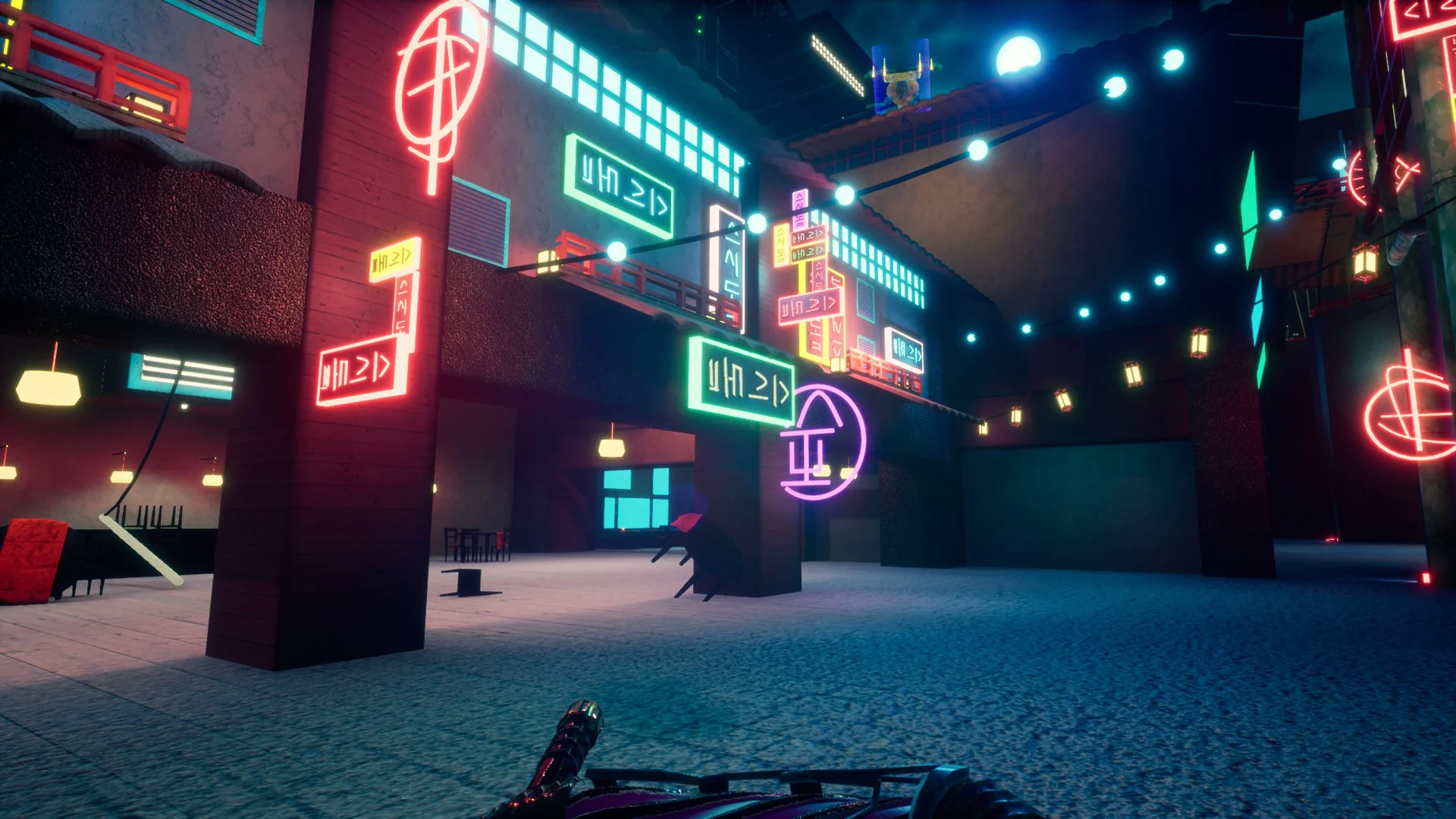
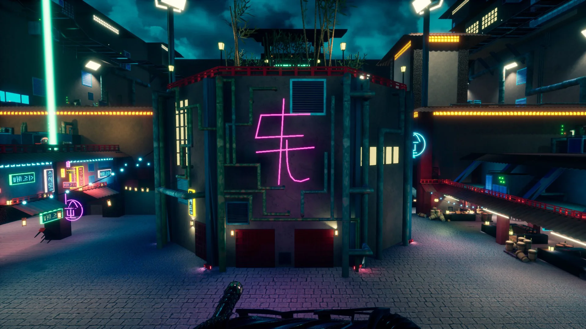
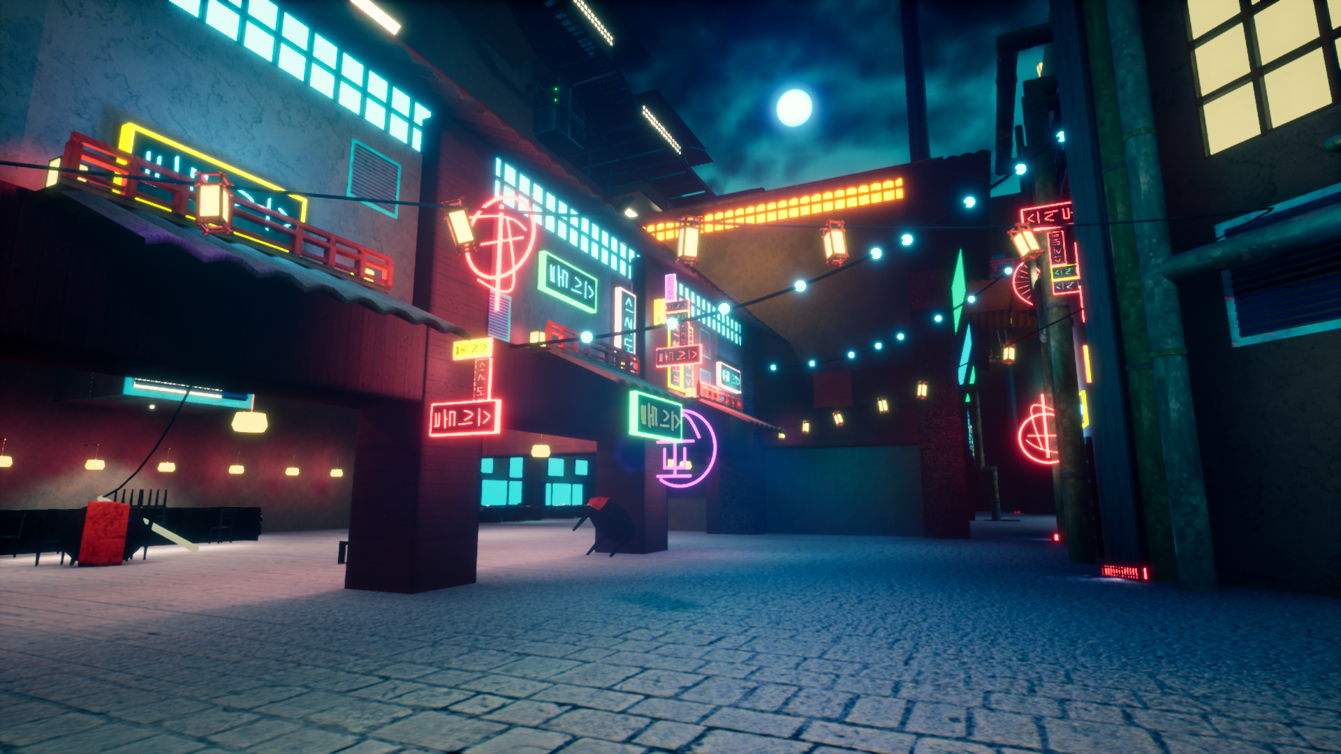
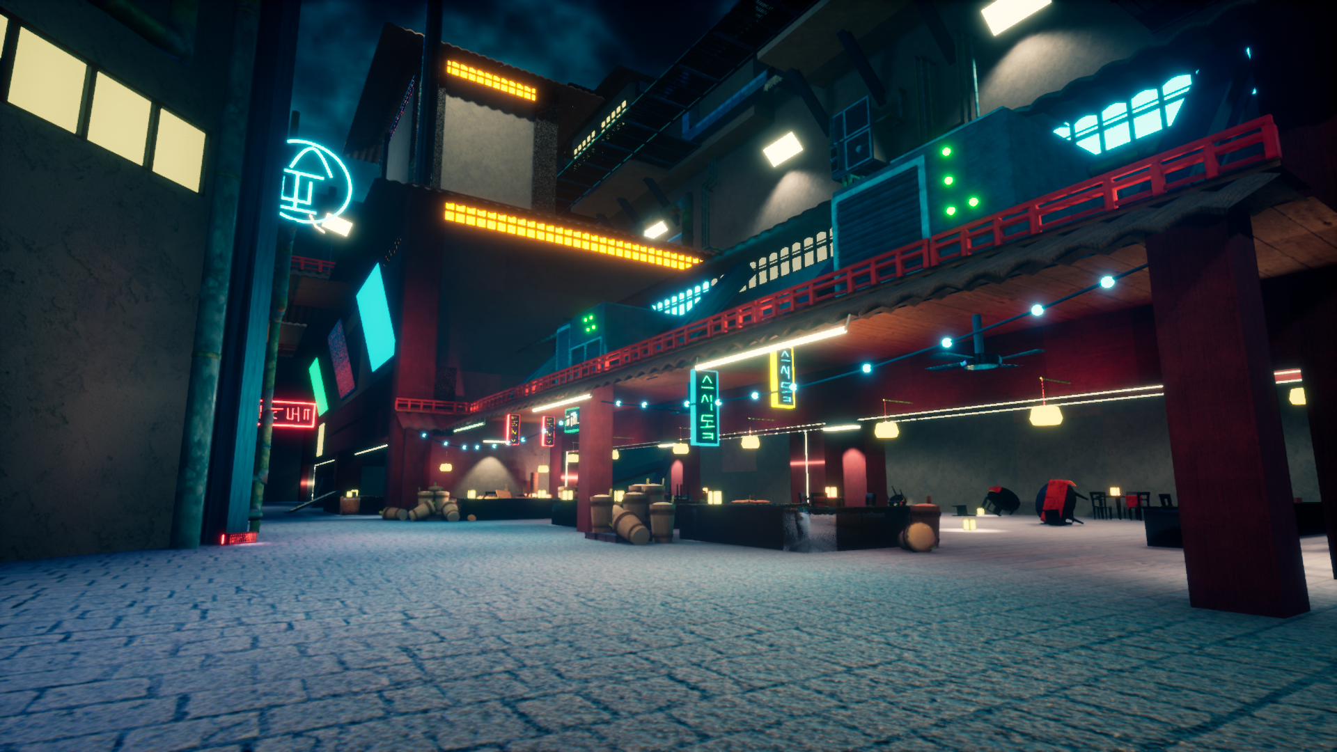
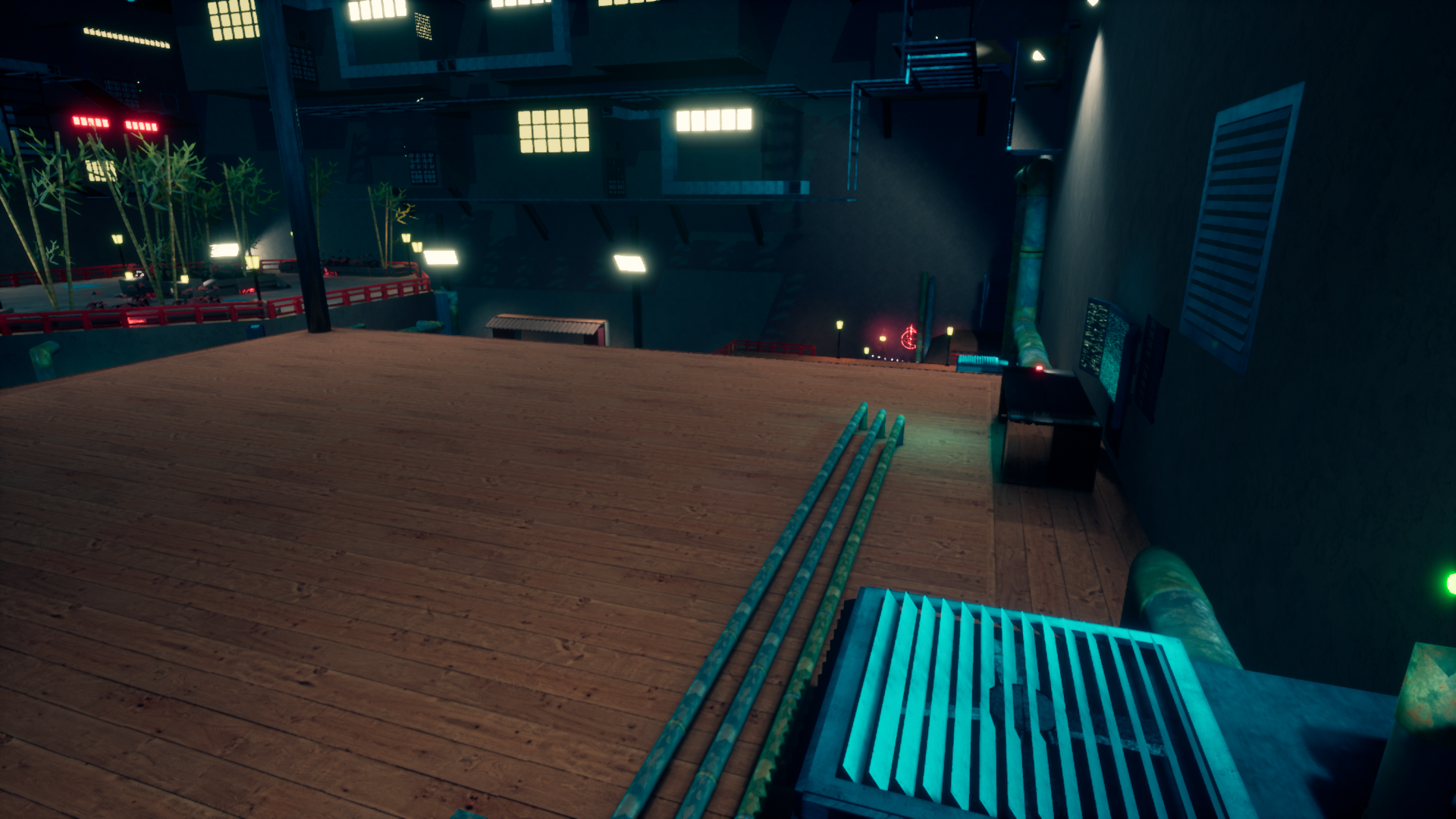
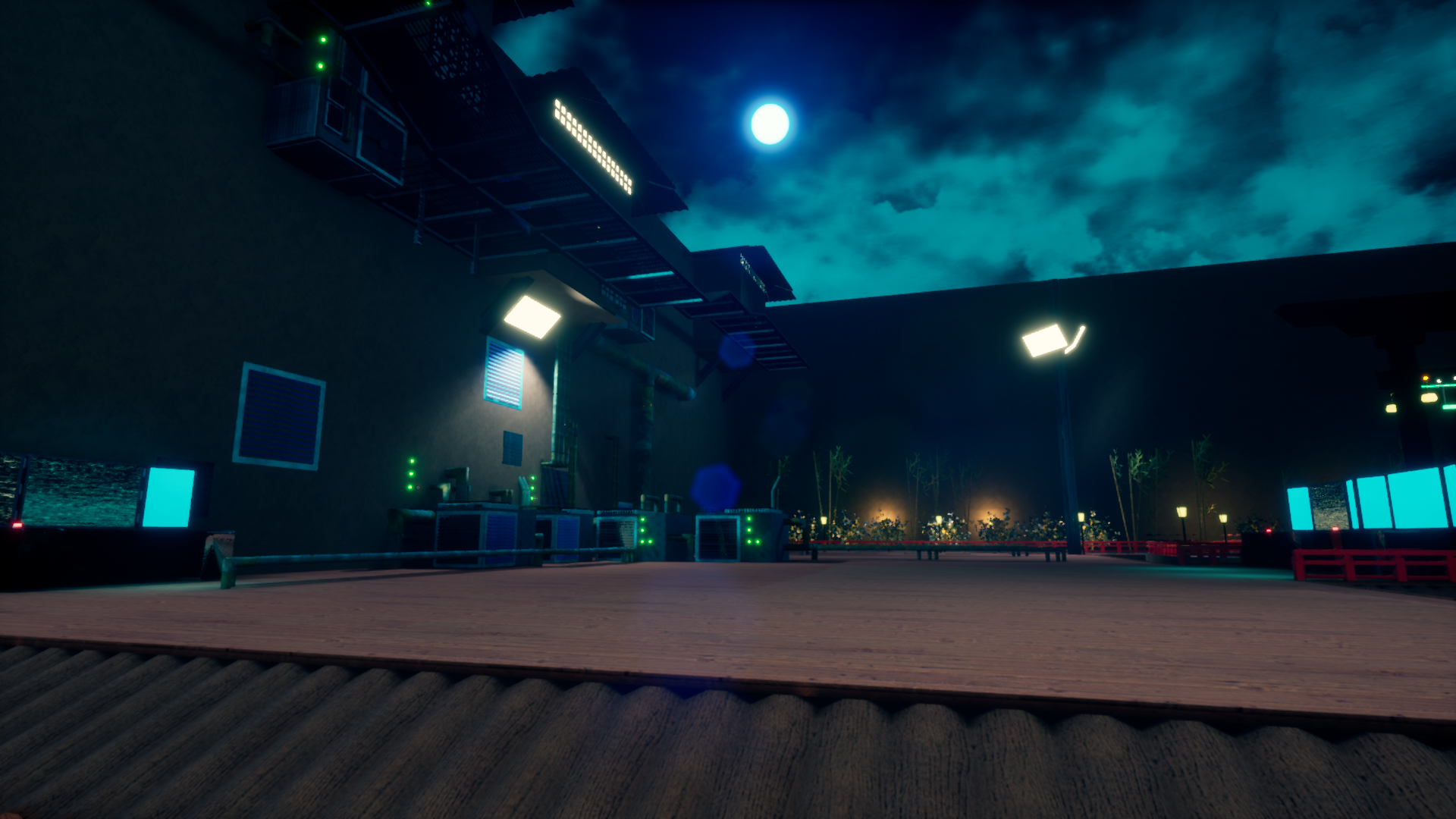
This level was primarily designed and worked on by Mihir Srivastava. Dumpling street is built around the concepts of multiple levels of verticality and varied, but memorable locations. In contrast to the rest of the levels in the game, Dumpling street is the only level where the entirety of the playspace is available to you for the entirety of your time in the level. The challenge from this level comes from a combination of the verticality and how enemies are handled. As our middle-tier difficulty level, we wanted this level to be relatively straightforward to play, require more vertical movement than Zen but less than Acid, and have more enemies than Zen while being less challenging than Acid.
This level was the second attempt we had at our second level after we pivoted away from a linear game to the game we have now. Mihir came to me after the construction of the first rendition of the level and expressed an unhappiness with it. In order to both improve morale and to get the best gameplay experience we could, I worked with Mihir to figure out what could be done to make the level all it could be. After a complete rework of the level, we quickly got the level to a point where it matched up with our other levels. From there, Mihir went into decorating the level while I worked on balancing the combat for the level. This level was the riskiest level in terms of performance, since Mihir, a designer with a specialization in lighting, did a lot of complex work with lighting, other effects, and experimental parts of UE4. Once we identified the risk of Dumpling Street, I worked with our programmers to identify what was causing our performance problems and figuring out how we could fix those.
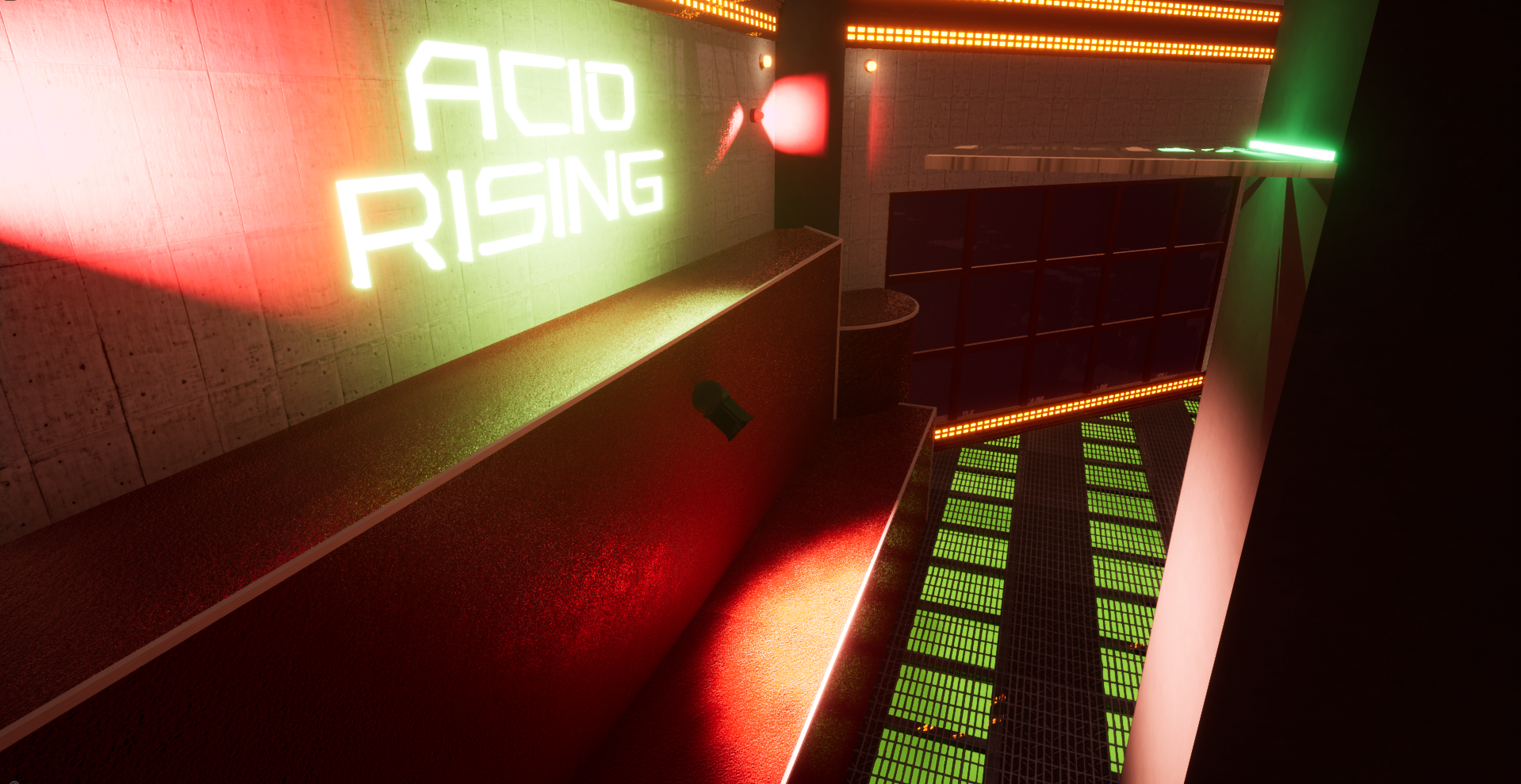
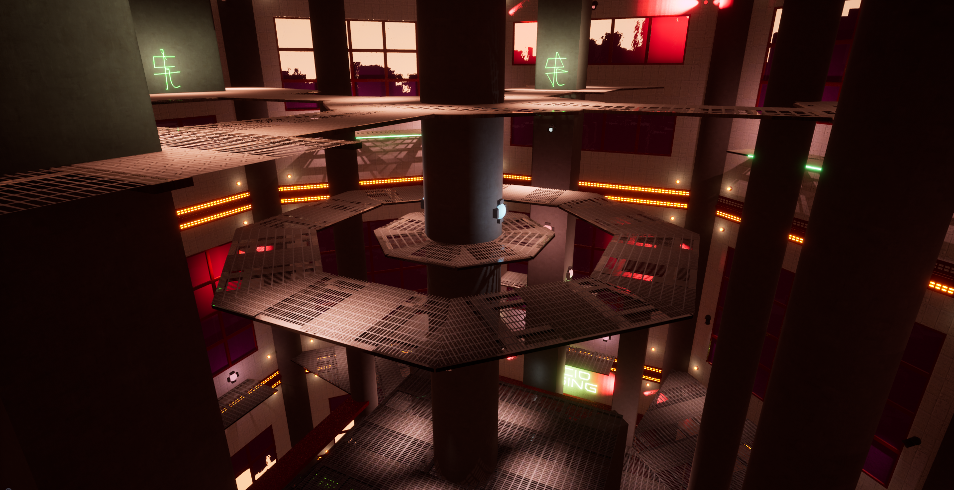
Acid
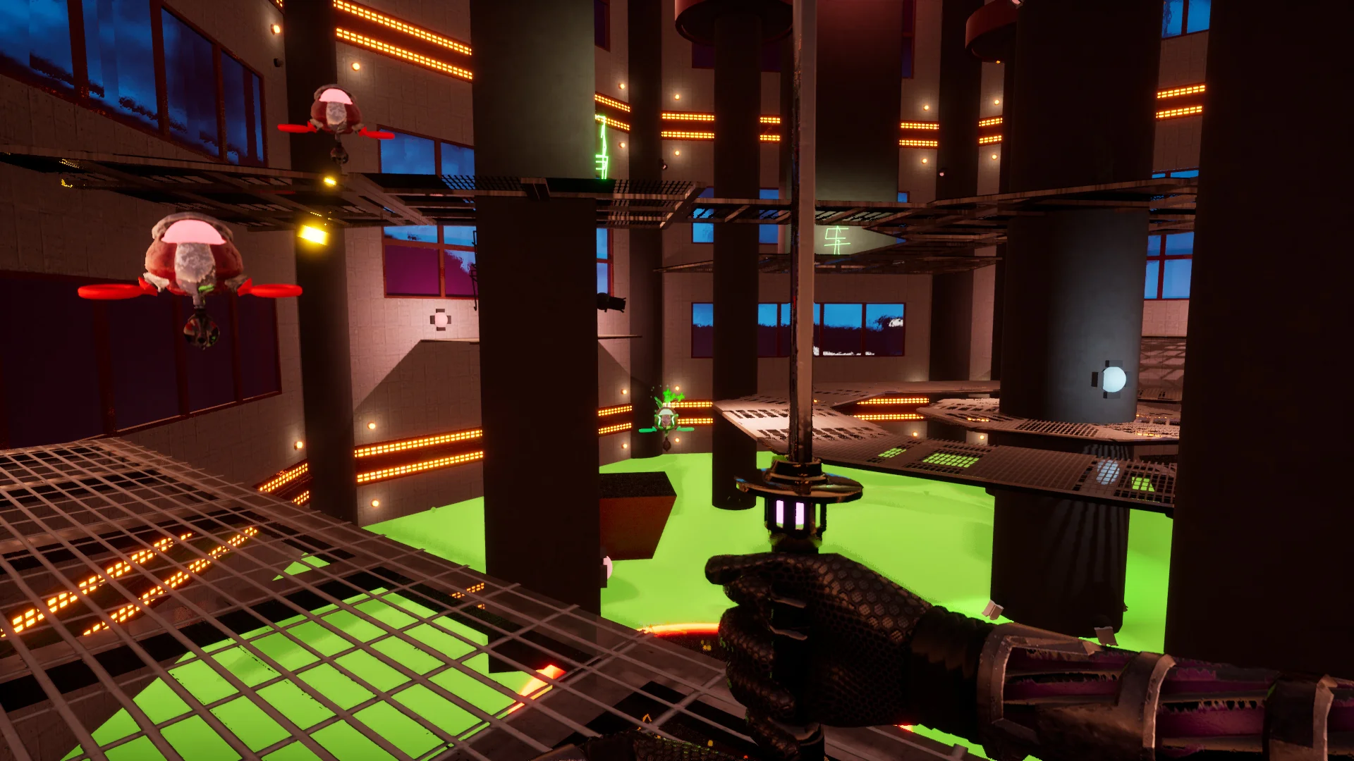
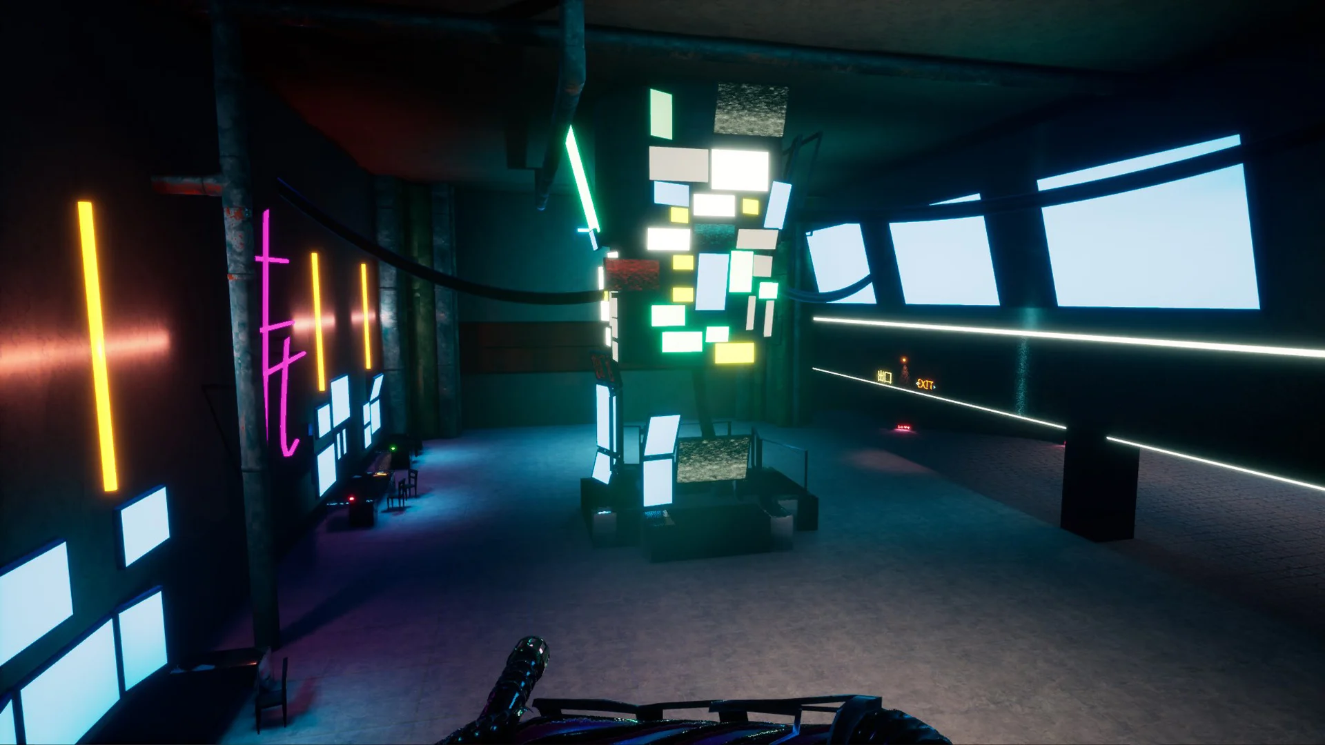
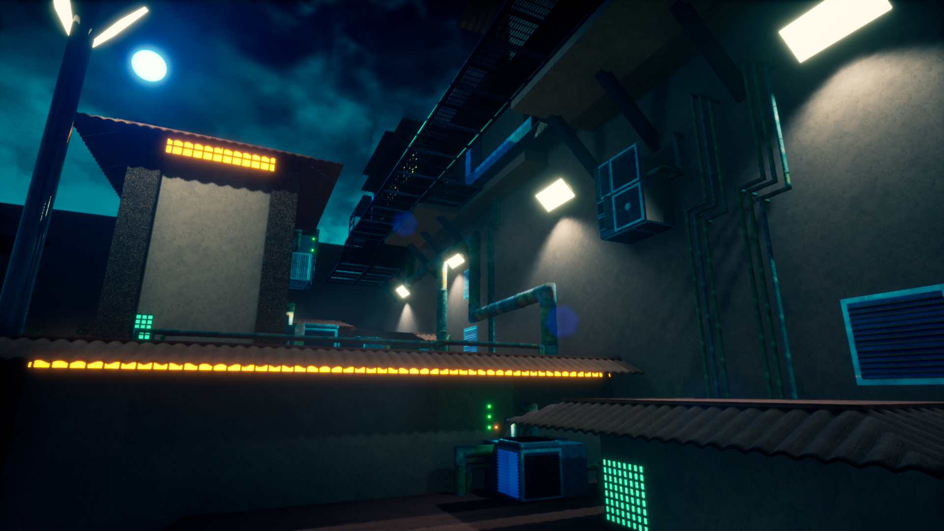
Acid was primarily designed and worked on by Blake Philley. Acid is the complete antithesis of Zen as a level. Whereas Zen opens up as you play, Acid actually constricts your playspaces as you play. Acid has four zones of playspaces within it. Zone 1, the ground area, is the easiest space to navigate in. All of the enemies in zone 1 are simple and there’s no acid to deal with. However, after clearing round 3, acid pours into the level and requires the player to platform up to zone 2, which is just above the acid’s resting height. In zone 2, there are some spots where the floor is covered by acid, but most of the space is walkable or easily accessed through jumping and the enemies are a little bit more difficult to deal with during the rounds in this zone. In similar fashion to zone 1, after you clear three rounds of combat, the acid rises again and you have to progress to the next zone. Zone 3 plays out like zone 2 and zone 4 is only a single round, but is the most difficult to get through. As you progress through each round the available floorspace shrinks until there’s very little that’s not covered by acid and the platforming required to get up to each zone gets progressively more difficult.
Acid was the level that I had my hand in the least. The designer for that level scoped appropriately and only really needed help with tedious things during sick days (setting the proper lightmap density on meshes as an example) and testing for edge-case bugs. However, during our initial phases, while all of the other designers were putting together their first passes at the level structures, I put together our system of invisible navigation ramps. Acid ended up using these “navramps” the most, but Blake ended up placing them in positions where their use was not noticeable in his level.

